
healthcare pro theme documentation
introduction
This kit is designed to help you build a clean, professional, and patient‑friendly website for your healthcare services. Whether you provide general medical care, specialized treatments, telemedicine consultations, or wellness programs, this template includes all the essential features to showcase your expertise and reassure patients with trust and clarity.
customizing your website
global settings
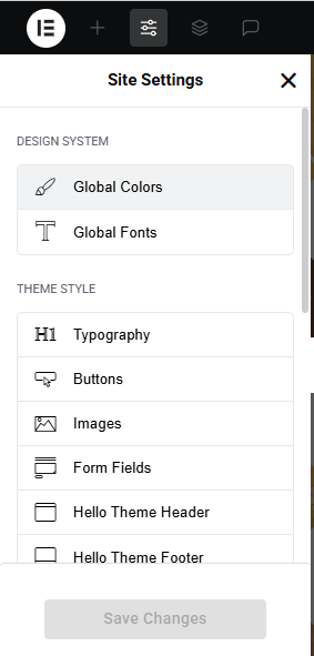
To set global styles:
- Go to Elementor > Site Settings.
- Adjust typography, colors, and layout settings.
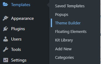
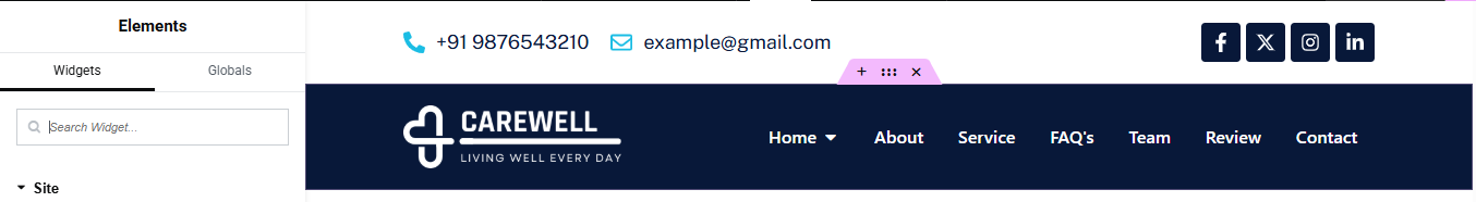
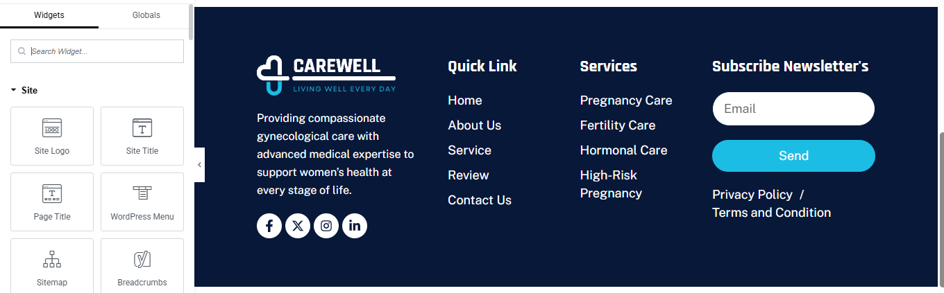
header & footer setup
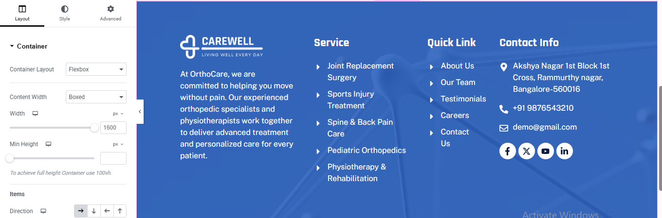
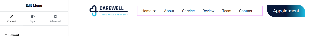
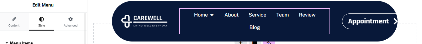
- Use Elementor Theme Builder to edit the header and footer.
- Customize the navigation menu, logo, and contact details.

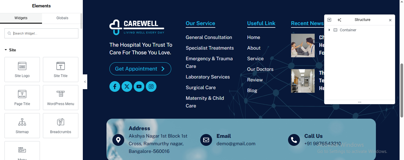
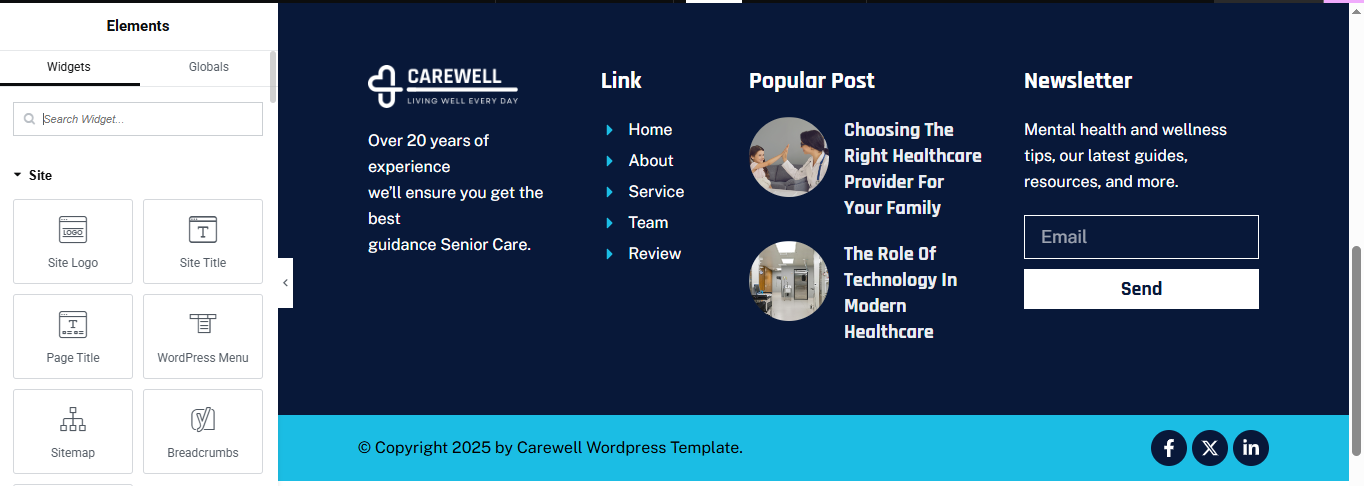
You can drag and drop the elementor widget’s menu first. If you’d like, you can add items or simply drag each one, after which you can add a icon list from the widget and apply a custom style from the style option.
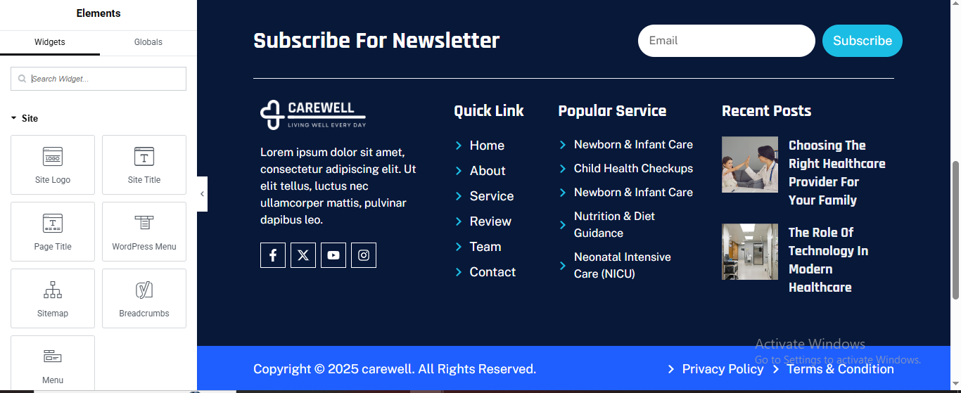
you can add newslatter form, timing, contact details, logo, gallery, menu and if you wish in footer, and create you best design.
home page setup
Using Pre-Built Layouts
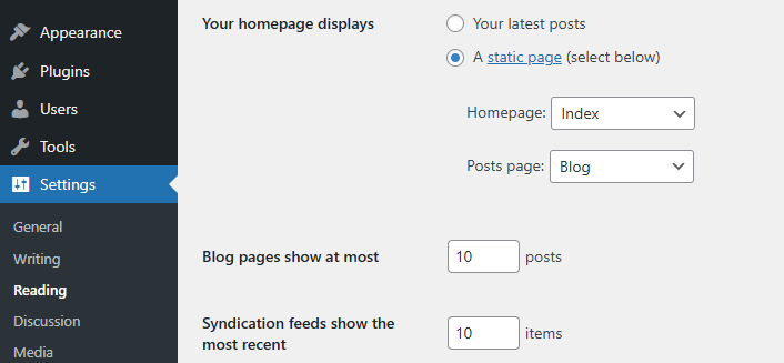
Navigate to Setting >> Reading
Choose the Static Page option.
Choose an existing homepage or create a new one.
Add The Section in home page using elementor
Add components such as these using the Drag & Drop Builder:
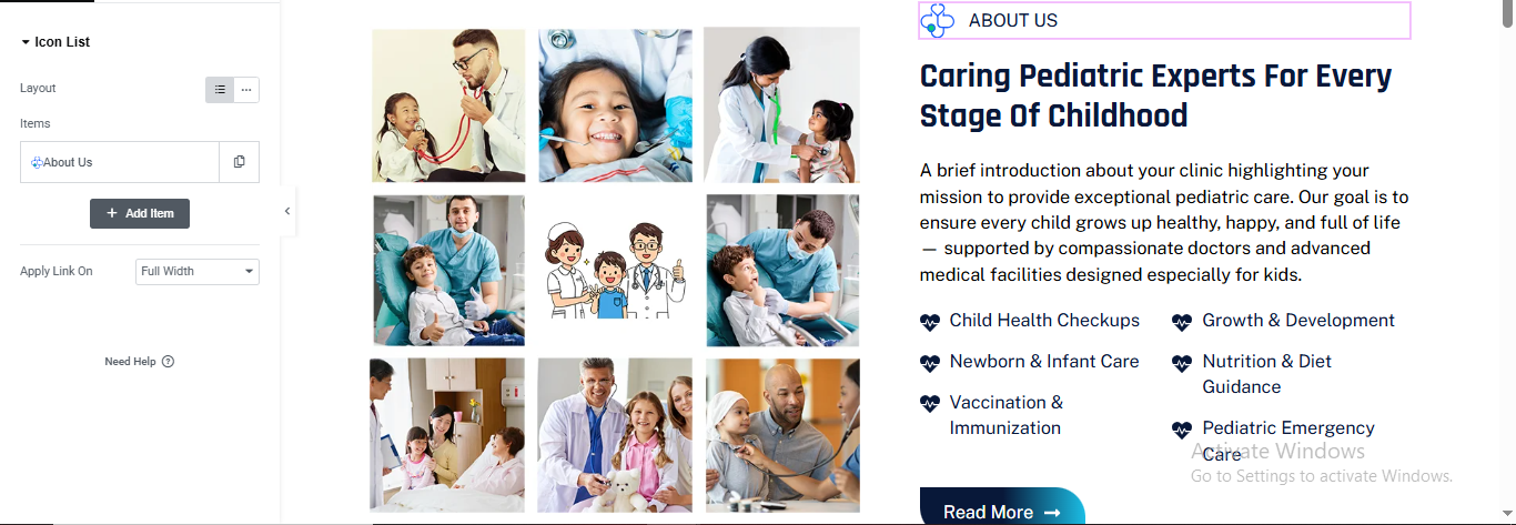
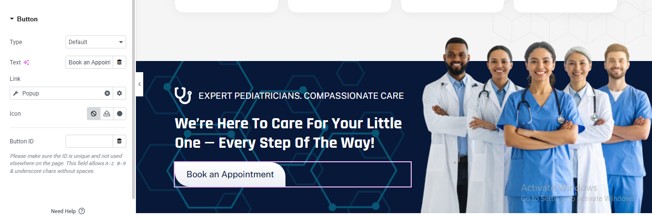
- Hero Slider Section
- about section
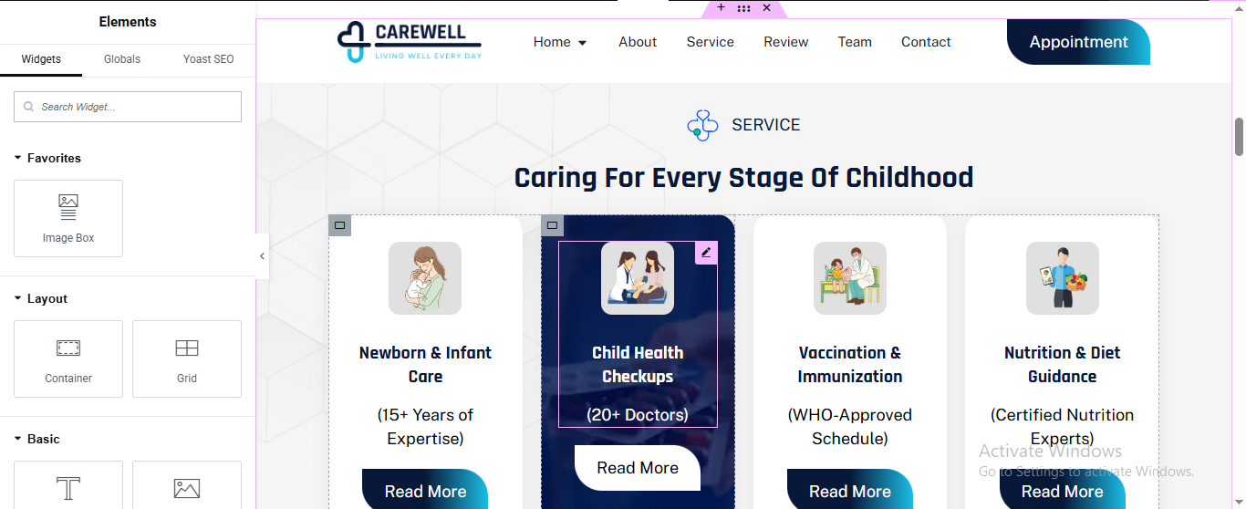
- services section
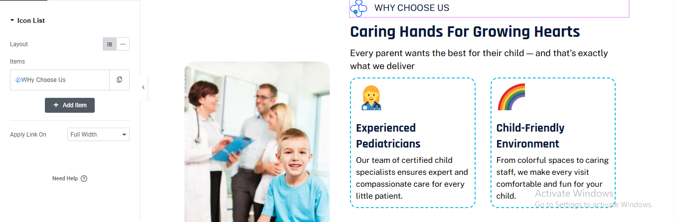
- why choose us section
- Achievements Section
- Department section
- CTA section
- Review Section
- Team Section
- FAQ’s Section
- blog section
- partner logo section
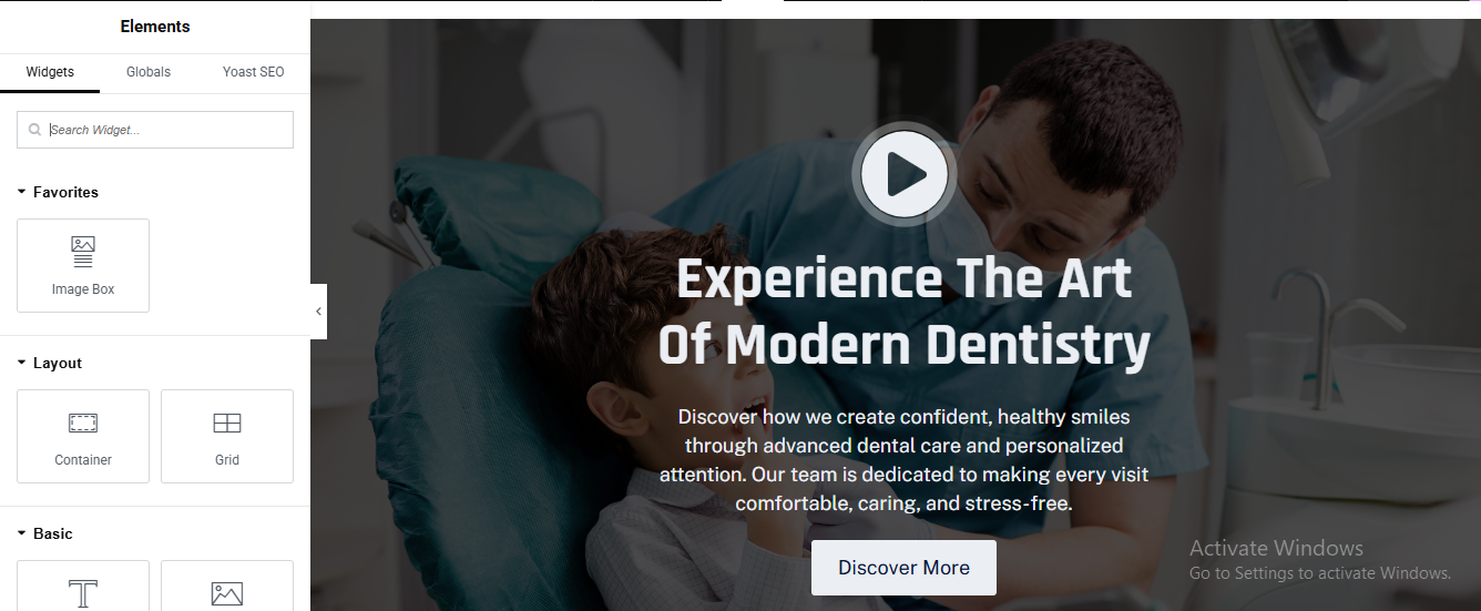
main hero slider section
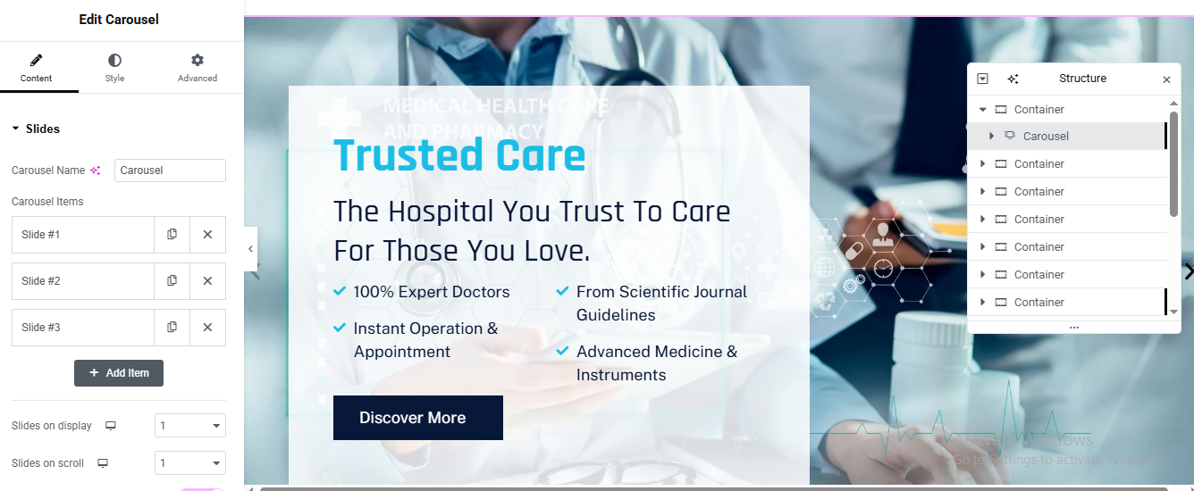
Add Carousel Widget
- Set Slides on Display → 1
- Set Slides on Scroll → 1
- Build Slide Structure
Carousel
└── Slide Container
├── Background Image
└── Inner Content Container
├── Subtitle Text
├── Heading
├── Feature List (Icon + Text)
└── ButtonSet Slide Background Image
- Click Slide #1
- Go to Style → Background
- Upload High-quality image (1920×900)
- Settings: Position: Center Center
- Size: Cover
- Repeat: No-repeat
- Add Overlay
- Color: #0b2c3d
- Opacity: 0.55
Repeat for Slide #2 & #3
Add Text Content
- Color: Light Blue
- Letter Spacing: 2px
- Font Size: 14px
✅ Main Heading
- Tag: H1
- Size: 58–64px
- Color: blue
- Description Text
- Feature List (Check Icons)
- Add Icon List widget
- Icon: ✔ (Check Circle)
- Icon Color: #00c3ff
- Text Color: White
CTA Button
- Add Button widget
- Background: Dark Blue
- Text Color: White
- Padding: 16px 32px
- Border Radius: 6px
All widget Repeat for Slide #2 & #3a
about section
Add Main Section (Container)
- Click ➕ Add Container
Left Column (Content – 55%)
- Section Label (Text Widget)
- Style
- Color: Primary Blue
- Font Size: 14px
- Font Weight: 600
- Letter Spacing: 2px
- Text Transform: Uppercase
Main Heading
- Text:
- typography
- Tag: H2
- Font Size: 42–48px
- Font Weight: 700
- Line Height: 1.3
- Color: Dark Blue
Description (Text Editor)
- Font Size: 16px
- Line Height: 1.7
- Color: Gray (#666)
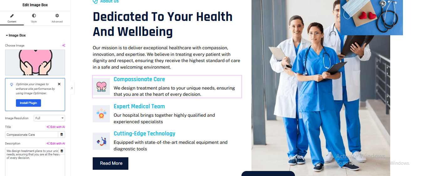
Feature Boxes (Image Box Widgets)
- Add 3 Image Box widgets (stacked vertically)
- Image Box #1
- Title:
- Description:
- Image: Heart / Care Icon (PNG or SVG)
- Style
- Icon Position: Left
- Background: Light Blue (#f2f9ff)
- Padding: 20px
- Border Radius: 8px
- repeat 3 time and change content and icon
Add Button widget
Right Column – Image Setup
- Add Image widget
- Upload doctor/team image
Service Section
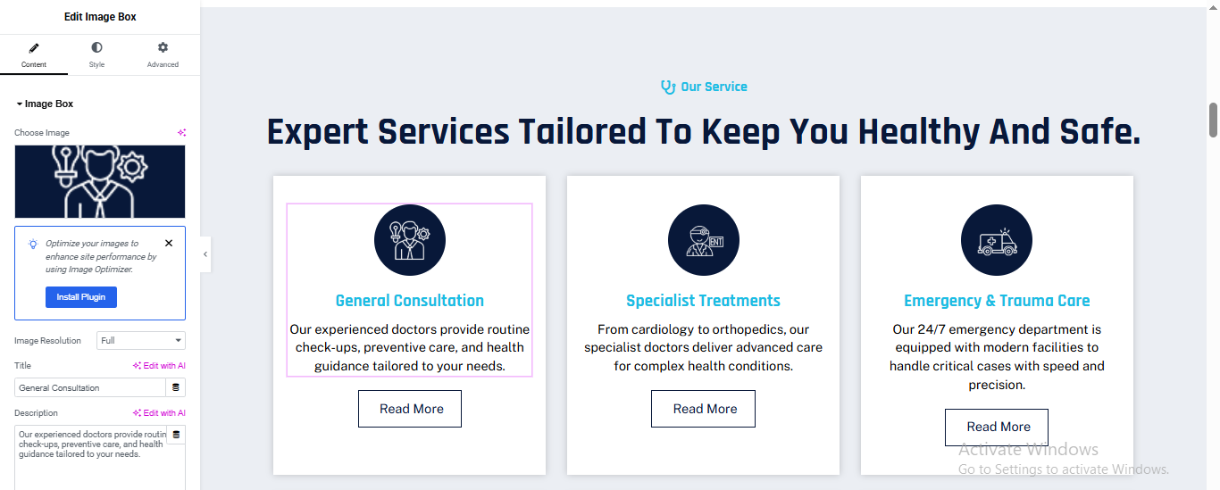
Add Main Section (Container)
- Click ➕ Add Container
- Small Label (Text Widget)
- Style
- Color: Primary Blue
- Font Size: 14px
- Font Weight: 600
- Text Transform: Uppercase
- Align: Center
Main Heading (Heading Widget)
- Style
- Tag: H2
- Font Size: 42–46px
- Font Weight: 700
- Line Height: 1.3
- Align: Center
Service Card (Repeatable)
- Add Image Box widget inside the grid
- (duplicate for each service)
Service Card Settings
- Content Tab
- Image:
- Title:
- Description:
- Style Tab
- Background Color: #ffffff
- Padding: 40px 30px
- Border Radius: 10px
- Box Shadow:X: 0, Y: 10, Blur: 30, Color: rgba(0,0,0,0.08)
Button
- Add Button widget below Image Box
- Style
- Background: Transparent
- Text Color: Dark Blue
- Border: 1px solid Dark Blue
- Padding: 10px 22px
- Border Radius: 6px
- Hover
- Background: Dark Blue
- Text Color: White
Duplicate for Other Services and cjange content and image/icon
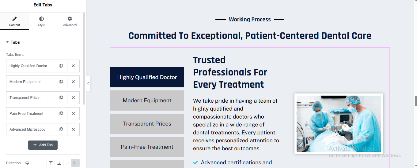
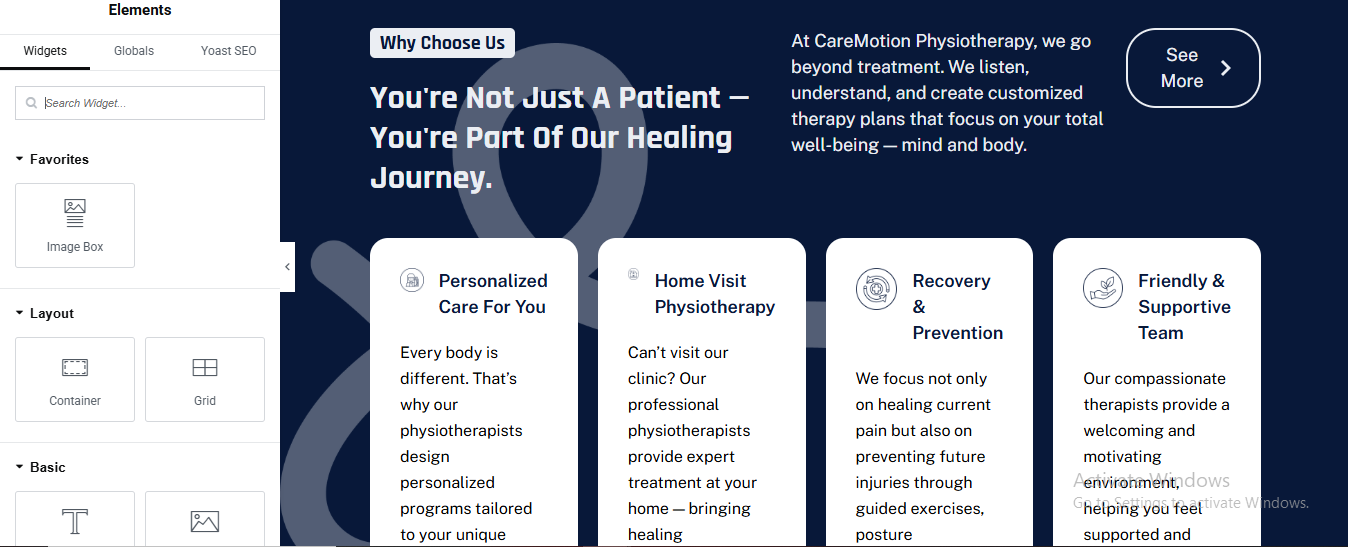
why choose us section
Add Main Section (Background Area)
- Click ➕ Add Container
- Background
- Style → Background → Color
- Color: #1e3a8a (Dark Blue)
Section Header
- Small Label (Text Widget)
- Style
- Color: #38bdf8
- Font Size: 14px
- Font Weight: 600
- Align: Center
Main Heading (Heading Widget)
- Style
- Tag: H2
- Color: #ffffff
- Font Size: 44–48px
- Font Weight: 700
- Line Height: 1.3
- Align: Center
Add Inner White Card Container
- Add Inner Container
- Style
- Background Color: #ffffff
- Border Radius: 16px
- Padding: 40px
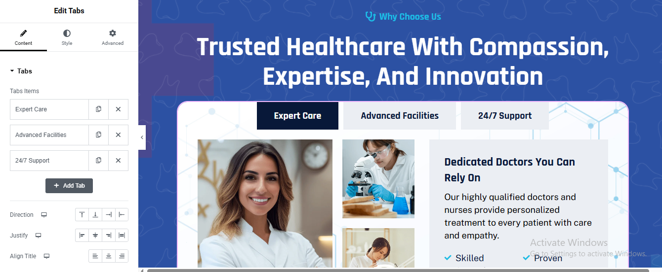
Add Tabs Widget
- Tab Layout (Inside Each Tab)
Left Column: 60%
Right Column: 40%
LEFT COLUMN – Images
- Add Image Widget
- Main Doctor Image (Large)
- Below add another Inner Container
- Direction: Row
- Add 2 smaller images
- Style
- Border Radius: 12px
- Box Shadow: Light
RIGHT COLUMN – Content
- Add widgets in order:
- Heading
- Font Size: 26px
- Font Weight: 600
- Icon List
- Icon color: Light Blue
- Tabs Styling
- Background: #f1f5f9
- Text Color: Dark Blue
- Padding: 14px 24px
- Border Radius: 8px
- Active Tab
- Background: #0f172a
- Text Color: #ffffff
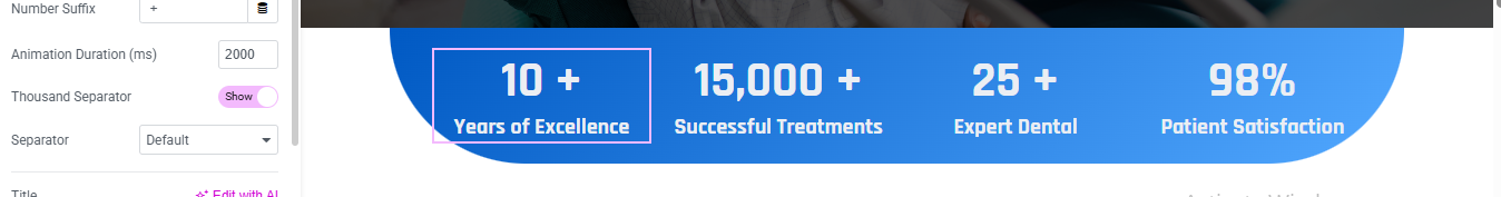
Achievements section
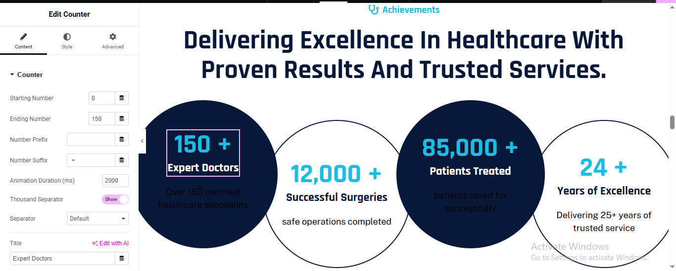
Counter Circle Design (Repeat 4 Times)
- Add Inner Container (Each Counter)
- Width: 25%
- Min Height: 300px
- Align Items: Center
- Justify Content: Center
- Style
- Background Color:
- Dark circle: #0b1c3d
- Light circle: #ffffff
- Border Radius: 50%
- Box Shadow:
- Blur: 30
- Color: rgba(0,0,0,0.15)
Counter Title & Description
- Title (Text Widget)
- Description (Text Widget)
- Create All Achievement Counters
- Number:
- Text:
Department Section
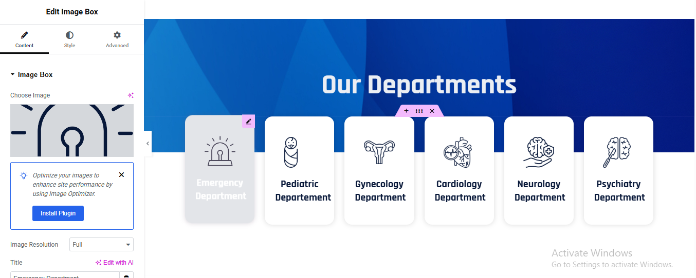
Create Main Section
- Click ➕ Add Container
- Style → Background
- Type: Gradient
- Angle: 120°
Create One Department Card (Repeat for All)
- Card Style
- Background Color: #ffffff
- Border Radius: 16px
- Box Shadow:X: 0, Y: 10, Blur: 30
- Color: rgba(0,0,0,0.12)
- Padding: 25px
- Add Icon / Image
Add Image Box OR Image Widget
- Image Settings
- Upload SVG / PNG medical icon
- Department Title
Active / Highlighted Card
- Style Changes
- Background Color: blue
- Icon Color: light
- Text Color: #ffffff
CTA section
CTA Background Styling
- Style → Background
- Type: Classic
- Image: Upload medical CTA image
- Position: Center Right
- Size: Cover
- Repeat: No-repeat
- Add Overlay (Important)
- Background Overlay Color: #ffffff
- Opacity: 0.92
Left Content Container
- Add Inner Container (Left side)
- Direction: Column
- Width: 55%
- CTA Small Label
- Add Text Editor
- Style
- Color: #0ea5e9
- Font Size: 14px
- Font Weight: 600
- Margin Bottom: 10px
CTA Heading: Add Heading
- Style
- Font Size: 36px
- Font Weight: 700
- Line Height: 1.3
- Color: #0f172a
- Margin Bottom: 20px
CTA Description
- Add Text Editor
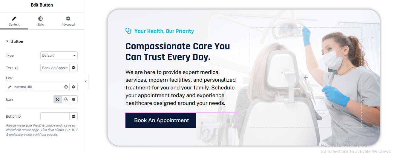
- CTA Button (Important)
- Add Button Widget
- Link to Contact Page
- Click Link → Dynamic Icon (⚙️)
- Choose:
- Internal URL
- Select Contact Page / Appointment Page
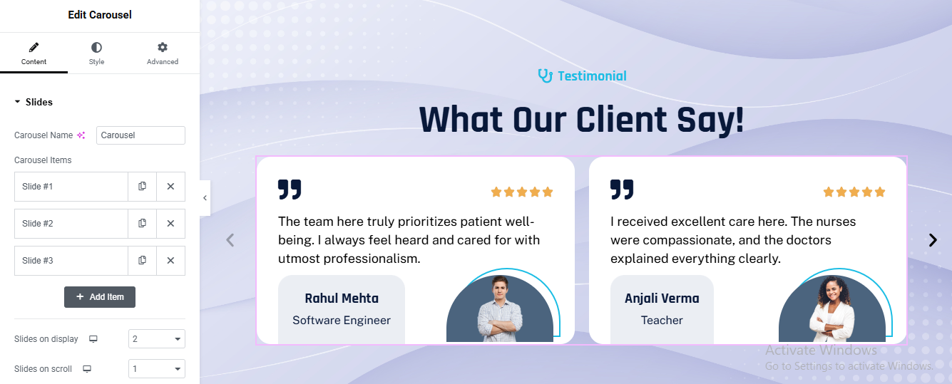
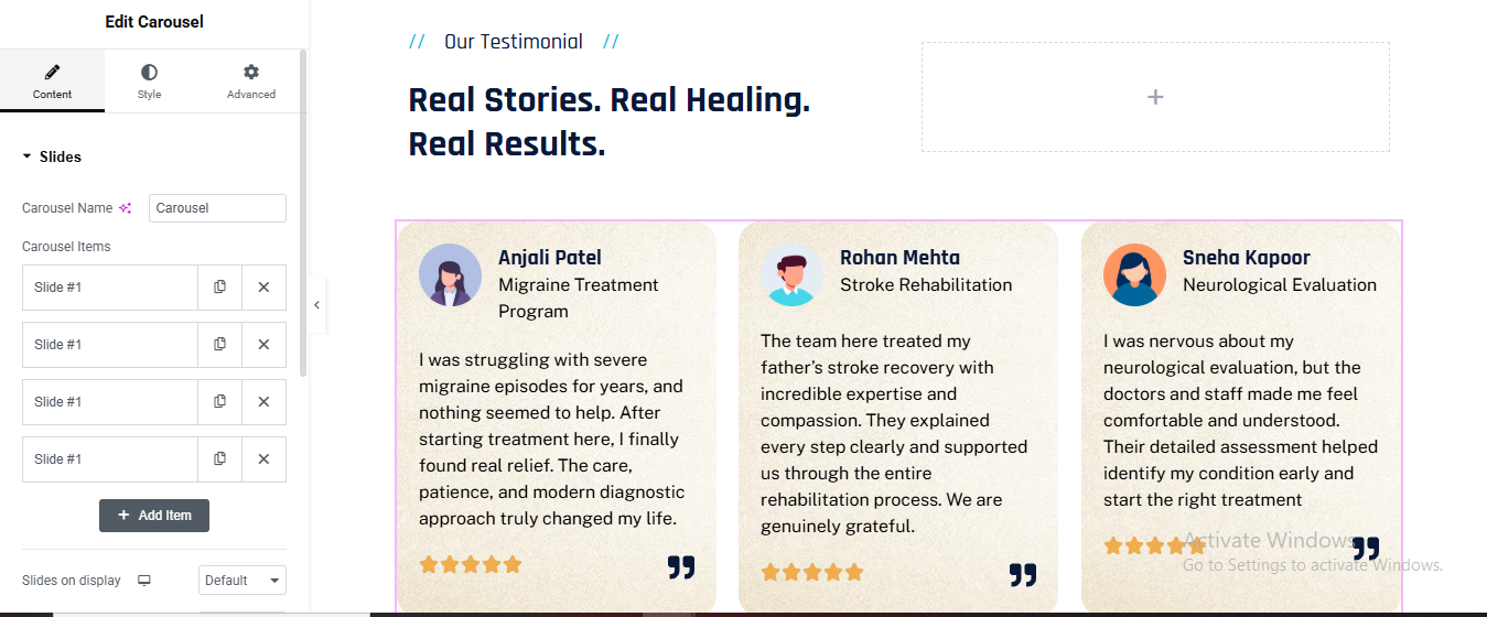
Review section
Add Main Section
- Click ➕ Add Container
- Background Design
- Style → Background
- Type: Gradient
- Color 1: #eef2ff
- Color 2: #e0e7ff
- Angle: 135°
Section Subtitle
- Add Text Editor
- Section Heading
- Add Heading
- Style
- Font Size: 42px
- Font Weight: 700
- Color: #0f172a
- Margin Bottom: 50px
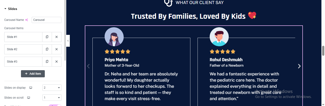
Add Carousel Widget
- Content → Slides
- Add 3 Slides
- Slides on Display: 2
- Slides to Scroll: 1
Testimonial Card Design (Inside Each Slide)
- Card Container Style
- Style → Container
- Background Color: #ffffff
- Padding: 35px
- Border Radius: 20px
- Box Shadow:X: 0, Y: 15, Blur: 40, Color: rgba(0,0,0,0.12)
Quote Icon
- Add Icon Widget
- Icon: Quote (“”)
- Size: 36px
- Color: #0f172a
- Review Text
- Style
- Font Size: 16px
- Line Height: 1.7
- Color: #334155
- Margin Bottom: 20px
- Star Rating
- Add Star Rating Widget
- Rating: 5
- Color: #fbbf24
- Size: 18px
- Alignment: Left
- Author Box
- Add Inner Container (Row)
- Left: Profile Image
- Size: 70px
- Border Radius: 50%
- Border: 3px solid #0ea5e9
- Right: Name & Role
- Add Heading
- Carousel Navigation
- Style → Navigation
- Arrows: Show
- Arrow Size: 24px
- Arrow Color: #0f172a
- Position: Outside
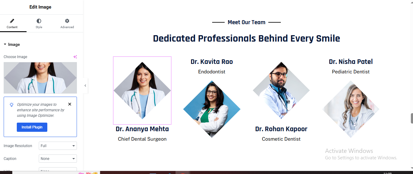
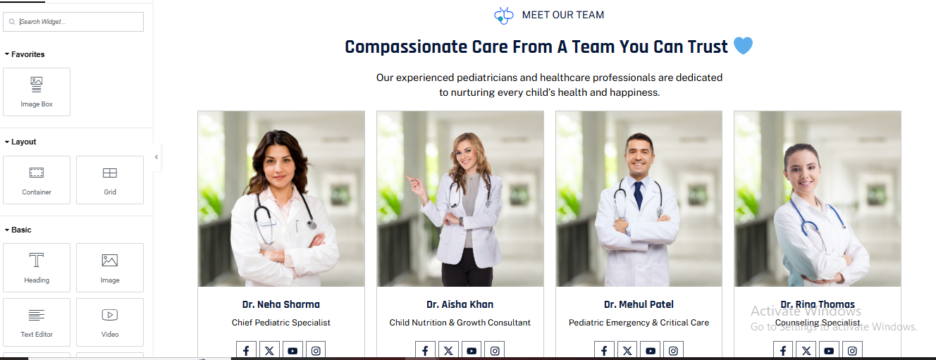
Team section
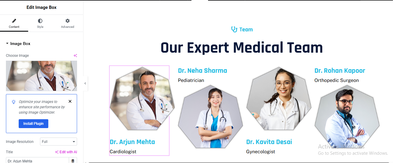
Add Team Member Content to Each Column
- For each column:
- Add an Image widget for the team member photo.
- Below the image, add:
- Heading widget for the name
- Text Editor widget for the designation.
FAQ section
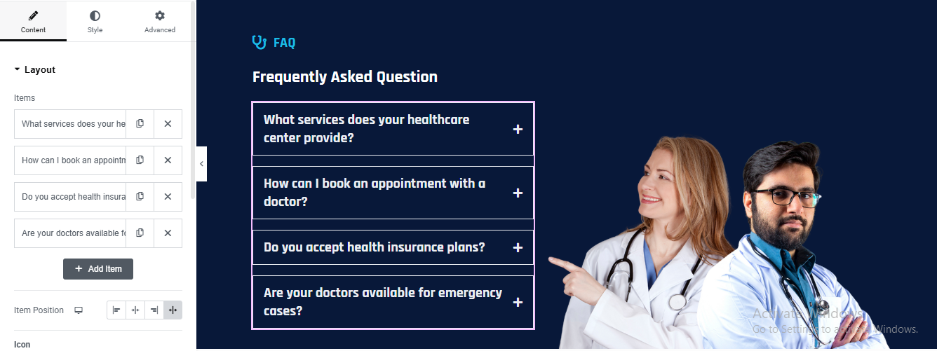
Create Main Section
- Click ➕ Add Container
- Background Styling
- Style → Background
- Type: Gradient
- Color 1: #020c2b
- Color 2: #0a1f44
- Angle: 120°
Add Two Inner Containers
- Left Container (FAQ)
- Width: 55%
- Right Container (Image)
- Width: 45%
- Align Items: Center
Add Accordion Widget
- Drag Accordion widget
- Content → Items
- Style → Accordion
- Text Color: #ffffff
- Background: #0b1d3a
- Padding: 18px 22px
- Border Radius: 6px
- Typography: 16px / 600
- Active Title
- Background: #102a5c
- Content
- Background: #06122f
- Text Color: #cbd5f5
- Padding: 18px 22px
- Add Right Image
- Add Image Widget
- Upload doctors image (PNG)
- Image Size: Full
- Max Width: 420px
- Align: Right
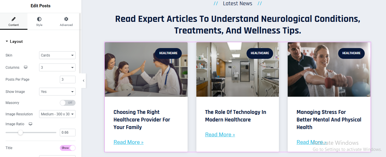
blog section
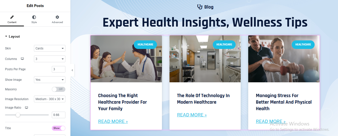
Add Main Section
- Click ➕ Add Container
- Background Design
- Style → Background
- Type: Gradient
- Color 1: #eaf4ff
- Color 2: #dbeafe
- Angle: 120°
Add Posts Widget
- Content → Layout
- Skin: Cards
- Columns: 3
- Posts Per Page: 3
- Show Image: Yes
- Image Resolution: Medium (300×300)
- Image Ratio: 0.66
- Masonry: Off
Query Settings
- Content → Query
- Source: Posts
- Order By: Date
- Order: DESC
Card Style
- Style → Card
- Background Color: #ffffff
- Border Radius: 14px
- Box Shadow:X: 0, Y: 20, Blur: 40
- Color: rgba(15, 23, 42, 0.12)
- Padding: 25px
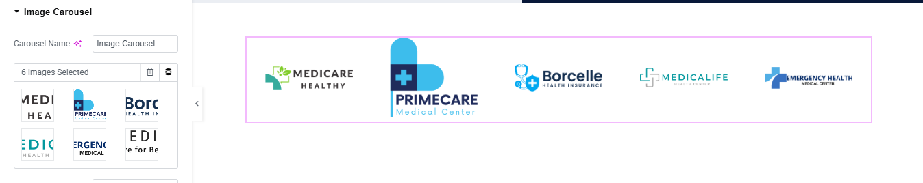
partner logo slider
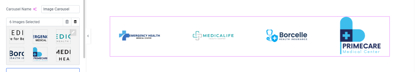
Add Section / Container
- Add Image Carousel Widget
- Upload Logos
- Content → Images
- Upload transparent PNG/SVG logos
- Image Size & Alignment
- Content → Image
- Image Size: Medium or Full
- Alignment: Center
This comprehensive guide will help you install, set up, and customize your Dentist Services Pro website to build a professional, reliable, and patient-focused medical platform.
Dentist pro theme documentation
introduction
customizing your website
global settings
To set global styles:
- Go to Elementor > Site Settings.
- Adjust typography, colors, and layout settings.
header & footer setup
- Use Elementor Theme Builder to edit the header and footer.
- Customize the navigation menu, logo, and contact details.

home page setup
Using Pre-Built Layouts
Navigate to Setting >> Reading
Choose the Static Page option.
Choose an existing homepage or create a new one.
Add The Section in home page using elementor
Add components such as these using the Drag & Drop Builder:
- Hero Section
- 3 box section
- about section
- services section
- Appointment Section
- why choose us section
- Video Section
- Achievement Section
- Working Process
- Team Section
- Review Section
- Contact Section
hero section
Click ➕ Add Container
- Select Main Container
- Go to Style → Background
- Background Type: Slideshow
Add Main Heading
- HTML Tag: H1
- Color: #FFFFFF
- Line Height: 1.2
- Font Weight: 700–800
Add Button widget
- Background: #FFFFFF
- Text Color: #061A3A
- Border Radius: 6px
- Padding: 16px 28px
Add Text Editor widget
- Color: #FFFFFF
- Font Size: 14px
- Margin Top: 15px
3 box section
Click ➕ Add Section
- Choose 3 columns
- Go to Section → Style
- Background → Color
- Choose Dark Blue / Navy
Add Icon Box (Column 1 – Phone)
- View: Stacked
- Shape: Circle
- Icon: Phone
Title:
Description:
Style Phone Icon Box
- Icon → Color: Dark Blue
- Background Color: White
- Size: 20–24px
Title
- Color: Light Blue / Cyan
- Weight: 600
- Size: 16–18px
Description
- Color: White
- Size: 14–15px
repeat 3 column
- Add Icon Box (Column 2 – Opening Hours)
- Add Icon Box (Column 3 – Email)
about section
Click ➕ Add Section
- Choose 2 Columns
- Left Column: 55%
- Right Column: 45%
- Section → Style
- Background: White / Light Gradient
Left Column – Content Area
- Small Heading
- Drag Heading widget
- Color: Dark Blue
- Typography:
- Size: 14px
- Weight: 600
- Letter Spacing: 1px
Main Heading
- Drag Heading widget
- Style:
- Size: 36–42px
- Weight: 700
- Line Height: 1.2em
- Color: Navy Blue
Description Text
- Drag Text Editor
- Style:
- Color: #555
- Font Size: 15–16px
- Line Height: 1.7em
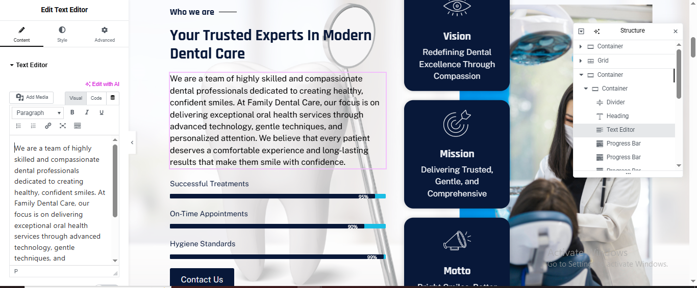
Progress Bars (Left Column)
- Add Progress Bar widget 3 times.
- Progress Bar 1
- Percentage: 95
- Style
- Bar Color: Dark Blue
- Height: 6px
- Typography: 14px
Contact Button
- Drag Button widget
- Style:
- Background: Dark Blue
- Text Color: White
- Border Radius: 4–6px
- Padding: 16px 30px
Right Column – Vision / Mission / Motto Cards
- Drag Inner Section
- Choose 1 Column
- Duplicate it 3 times
Card Structure (Each Card)
- Inside each inner section:
- Background: Dark Blue
- Border Radius: 14–16px
- Padding: 30px
- Margin Bottom: 20px
Add Icon
- Color: Light Blue
- Size: 40px
Card Heading
- Add Heading
- Color: White
- Size: 20px
Card Text
- Add Text Editor
- Color: #E0E0E0
- Size: 14px
Repeat for:
- ✔ Mission
- ✔ Motto
service section
Click ➕ Add Section
- Choose 2 Columns
- Left Column: 60%
- Right Column: 40%
Left Column – Section Heading
- Drag Heading
- Text:
- Style:
- Color: Dark Blue
- Size: 14px
- Weight: 600
Main Title
- Drag Heading
- Style:
- Size: 38–42px
- Weight: 700
- Line Height: 1.2em
Description
- Drag Text Editor
- Style:
- Size: 15–16px
- Color: #555
- Line Height: 1.7em
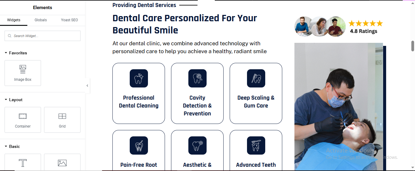
Services Grid (Cards)
- Add Inner Section
- Drag Inner Section inside Left Column
Choose 3 Columns
- Service Card Setup (Each Card)
- Icon Box
- Drag Icon Box
- View: Stacked
- Shape: Rounded
Icon Box Style
- Icon
- Color: White
- Size: 28px
- Padding: 20px
Box
- Background: Dark Blue
- Border Radius: 16px
- Padding: 30px
Duplicate for All Services
Right Column – Image + Rating
- Drag Image widget
- Upload dentist image
- Rating Badge
- Drag Star Rating
- Rating: 4.8
- Stars Color: Gold
- Position: Above image or overlay using Absolute positioning
Appointment section
Click ➕ Add Section
- Choose 2 Columns
- Left Column: 40%
- Right Column: 60%
Section → Style
- Background Color: Dark Navy Blue
Section Title
Drag Heading
- Text:
- Style:
- Color: White
- Size: 36px
- Weight: 700
- Alignment: Center
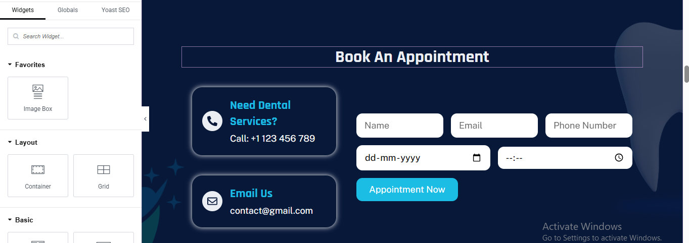
Left Column – Contact Cards
- Card 1: Phone
- Drag Icon Box
- Content:
- View: Stacked
- Shape: Circle
- Icon: Phone
- Title:
- Description:
- Call: +1123 456 789
- Style
- Background: Dark Blue
- Border Radius: 16px
- Padding: 30px
- Box Shadow:
Card 2: Email
- Duplicate card and change:
- Icon:
- Title:
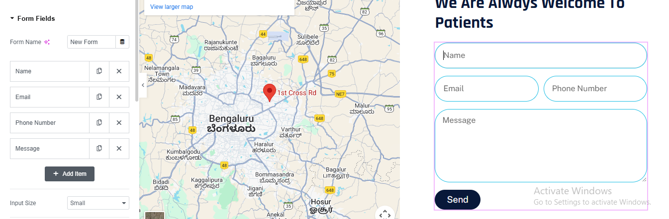
Right Column – Appointment Form
- Add Form Widget
- Elementor Form (Pro)
- Required Fields
- Name (Text)
- Email (Email)
- Phone Number (Tel)
- Date (Date)
- Time (Time)
Form Styling
- Input Fields
- Background: White
- Border Radius: 12px
- Height: 50px
Button
- Background: Cyan Blue
- Text Color: White
- Padding: 14px 32px
- Border Radius: 10px
why choose us section
Click ➕ Add Section
- Choose 2 Columns
- Left Column: 45%
- Right Column: 55%
Left Column – Image Grid
- Add Inner Section
- Add Images
- Drag Image
- Upload dental images
- Style → Border Radius:
Right Column – Content
- Small Heading
- Drag Heading
- Style:
- Size: 14px
- Weight: 600
- Color: Dark Blue
Main Heading
- Drag Heading
- Style:
- Size: 36–40px
- Weight: 700
- Line Height: 1.2
Description
- Drag Text Editor
- Style:
- Color: #555
- Line Height: 1.7
Feature List (Checkmarks)
- Add Icon List
- Drag Icon List
- Icon List Style
- Icon: ✔
- Icon Color: Cyan Blue
- Text Color: Dark Blue
- Size: 16px
- Spacing: 10px
video section
Click ➕ Add Section
- Choose 1 Column
- Drag Video widget
- Video Type: YouTube / Vimeo
- Enable:
- Image Overlay: ON
- Play Icon: ON
- Size: 80px
- Align: Center
Add Main Heading
- Drag Heading
- Style:
- Color: White
- Size: 44–52px
- Weight: 700
- Alignment: Center
Drag Text Editor
- Style:
- Color: #E0E0E0
- Size: 16px
- Line Height: 1.7
- Alignment: Center
CTA Button
- Drag Button
- Style:
- Background: White
- Text Color: Dark Blue
- Border Radius: 6px
- Padding: 14px 32px
achievement section
Click ➕ Add Section
- Section Background (Blue Curve Style)
- Section → Style
- Background → Gradient
- Color 1: Dark Blue
- Color 2: Light Blue
- Direction: Left → Right
- Advanced → Border Radius: 0 0 120px 120px
Add Inner Section (4 Columns)
- Drag Inner Section
- Choose 4 Columns
- Column Width: 25% each
- Add Counter Widget (Each Column)
Drag Counter Widget
- Add Counter widget into each column
- Counter 1 – Years of Excellence
- Starting Number: 0
- Ending Number: 10
- Number Suffix: +
- Title:
- Counter Styling
- Number
- Color: White
- Typography:
- Size: 42–48px
- Weight: 700
- Title
- Color: White
- Size: 14–15px
- Weight: 500
- Alignment
- Center
working process section
Click ➕ Add Section
- Choose 1 Column
Section Heading
- Drag Heading
- Text:
- Style:
- Size: 14px
- Weight: 600
- Color: Dark Blue
- Align: Center
Main Title
- Drag Heading
- Text:
- Style:
- Size: 34–38px
- Weight: 700
- Align: Center
- Margin Bottom: 40px
Add Tabs Widget
- Drag Tabs widget
- Content → Tabs Items
Tab Content Layout (Each Tab)
- Inside Tab Content add:
- Heading
Text Editor (Description)
- Icon List
- Add Icon List with:
- Icon: ✔
- Color: Cyan Blue
- Image
- Add Image widget (right aligned)
- Border Radius: 10px
- Box Shadow: 0 10px 25px rgba(0,0,0,0.15)
Tabs Styling
- Tab Title (Left Side)
- Style → Tabs
- Background: #D9D9D9
- Active Background: Dark Blue
- Text Color: Dark Blue
- Active Text Color: White
- Padding: 18px
team section
Click ➕ Add Section → Choose 1 Column
- Add Section Heading
- Drag Heading Widget
- Text:
- Style Tab:
- Typography → Size: 16px
- Weight: 600
- Color: #1a1a1a (Dark)
- Align: Center
Add Main Title
- Text:
- HTML Tag: H2
- Style Tab:
- Typography → Size: 36-42px
- Weight: 700
- Color: #0a1f44 (Dark Blue)
- Align: Center
- Line Height: 1.3
Click ➕ Add New Section → Choose 4 Columns (or use a Gallery Widget)
- Add Team Members (Repeat for Each)
- Image Setup
- Drag Image Widget
- Name Heading
- Style Tab:
- Typography → Size: 22-24px
- Weight: 700
- Color: #0a1f44
- Align: Center
Designation Text
- Style Tab:
- Typography → Size: 15-16px
- Weight: 400
- Color: #666666
- Align: Center
team section
Click ➕ Add Section → Choose 1 ColumnSection Settings:
- Background Color: #f5f5f7 (Light gray/purple tint)
Add Section Heading
- Drag Heading Widget
- Text:
- HTML Tag: H4 or H5
- Style Tab:
Typography → Size: 14-16px
- Weight: 600
- Color: #1a1a1a
- Align: Center
Add Main Title
- Drag Heading Widget
- Text:
- HTML Tag: H2
- Style Tab:
- Typography → Size: 36-42px
- Weight: 700
- Color: #1a2b4a (Dark Navy Blue)
- Align: Center
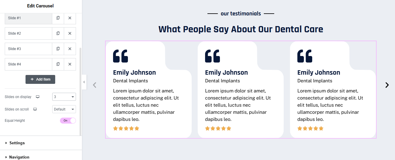
Add Carousel Widget
- Slides on Display: 3
- Slides on Scroll: Default (or 1)
- Equal Height: ON (Toggle to pink/active)
- Add Item: Click to add Slide #1, #2, #3, #4
Configure Each Slide/Testimonial Card
- Quote Icon
- Drag Icon Widget
- Style Tab:
- Primary Color: #1a2b4a (Dark Navy)
- Size: 60-80px
- Align: Left
Customer Name
- Drag Heading Widget
- Text:
- HTML Tag: H3
- Style Tab:
- Typography → Size: 20-22px
- Weight: 700
- Color: #1a2b4a
- Align: Left
- Review Text
Drag Text Editor Widget
- Style Tab:
- Typography → Size: 15-16px
- Weight: 400
- Color: #4a4a4a
- Align: Left
- Line Height: 1.6
Star Rating
- Drag Star Rating Widget
- Style Tab:
- Unmarked Color: #e0e0e0
- Marked Color: #ffa500 (Orange/Gold)
- Size: 18-20px
- Spacing: 3px
- Align: Left
contact section
Click ➕ Add Section → Choose 2 Columns
- Set Background Image/Overlay
- Section → Style Tab:
- Background:
- Type: Classic
- Image: Upload dental/medical professional image
- Position: Center Center
- Repeat: No-repeat
- Size: Cover
Left Column – Contact CTA
- Add Small Heading
- Drag Heading Widget
- Content Tab:
- HTML Tag: H4
- Style Tab:
- Typography → Size: 16-18px
- Weight: 500
- Color: #ffffff (White)
- Align: Left
- Text Transform: None
Add Main Headline
- Drag Heading Widget
- Style Tab:
- Typography → Size: 48-56px
- Weight: 700
- Color: #4dd0e1 (Cyan/Turquoise)
- Align: Left
- Line Height: 1.2
Add Call-to-Action Button
- Drag Button Widget
- Style Tab:
- Typography → Size: 16-18px
- Weight: 500
- Text Color: #1a2b4a (Dark navy)
- Background Color: #ffffff (White)
- Border Radius: 0-4px (minimal radius)
- Padding: 18px 45px
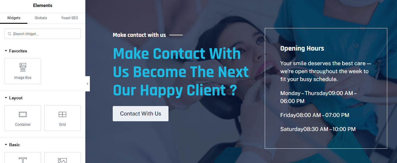
Right Column – Opening Hours Box
- Create Opening Hours Container
Style Tab: - Background: rgba(255,255,255,0.1) (Semi-transparent white)
- Border Type: Solid
- Border Width: 2px
- Border Color: #ffffff or #4dd0e1
- Border Radius: 8-12px
- Padding: 40-50px
- added text editor and added hour
This dental clinic website serves as a comprehensive digital platform designed to present professional dental services with trust, transparency, and patient-focused care. Built with both modern aesthetics and usability in mind, the website enables visitors to easily explore treatments, understand procedures, book appointments, and connect with experienced dental professionals.
physiotherapist pro theme documentation
introduction
customizing your website
global settings
To set global styles:
- Go to Elementor > Site Settings.
- Adjust typography, colors, and layout settings.
header & footer setup
- Use Elementor Theme Builder to edit the header and footer.
- Customize the navigation menu, logo, and contact details.
home page setup
Using Pre-Built Layouts
Navigate to Setting >> Reading
Choose the Static Page option.
Choose an existing homepage or create a new one.
Add The Section in home page using elementor
Add components such as these using the Drag & Drop Builder:
- Hero Section
- about section
- services section
- achievement Section
- why choose us section
- appointment section
- Review Section
- Contact Section
- Partner logo slider
hero section
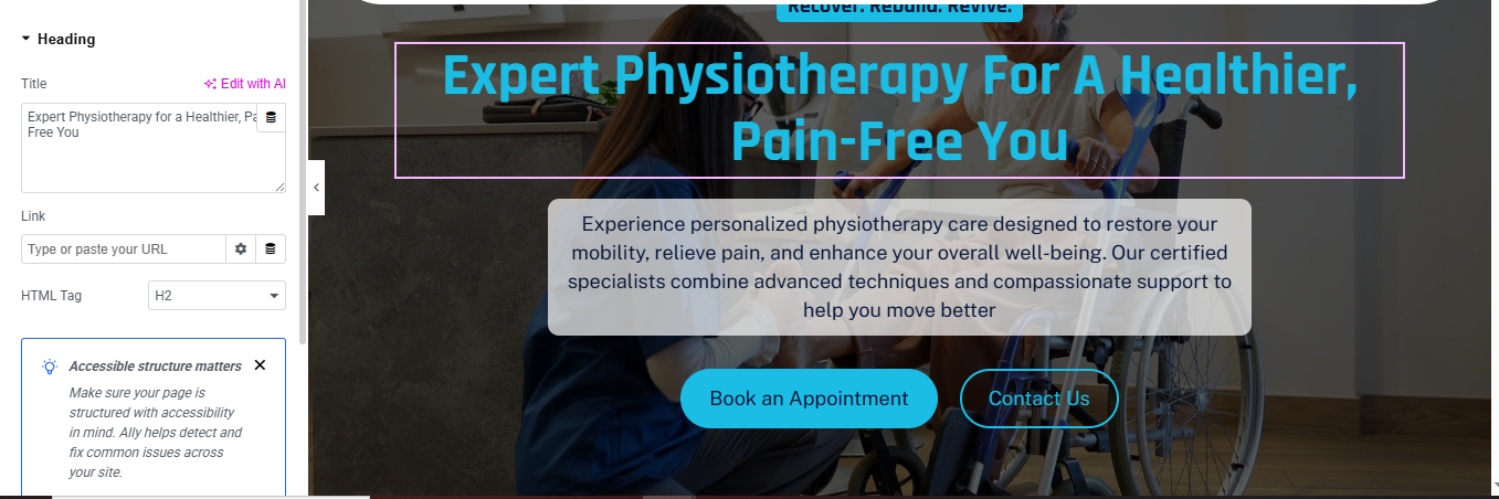
Click ➕ Add Section
- Choose 1 Column
- Background Image
- Section → Style
- Background → Classic
- Upload physiotherapy treatment image
- Position: Center Center
- Size: Cover
- Repeat: No Repeat
Add Main Heading (Title)
- Drag Heading widget
- Text:
- HTML Tag: H1
- Alignment: Center
- Style
- Color: Cyan / Light Blue
- Size: 44–52px
- Font Weight: 700
- Line Height: 1.2em
Add Description Box (Text Card)
- Drag Text Editor
- Paste description text
- Align: Center
- Style
- Text Color: #0A2540
- Background Color: White
- Padding: 20px 30px
- Border Radius: 12px
- Max Width: 650px
- Box Shadow: 0 15px 40px rgba(0,0,0,0.25)
Add CTA Buttons
- Drag Button widget
- Duplicate it (2 buttons)
- Button 1 – Primary
- Text:
- Style:
- Background: Cyan Blue
- Text Color: White
- Border Radius: 30px
- Padding: 14px 34px
Button 2 – Secondary
- Style:
- Background: Transparent
- Border: 2px solid Cyan Blue
- Text Color: Cyan Blue
- Border Radius: 30px
- Padding: 14px 34px
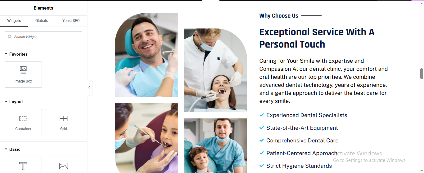
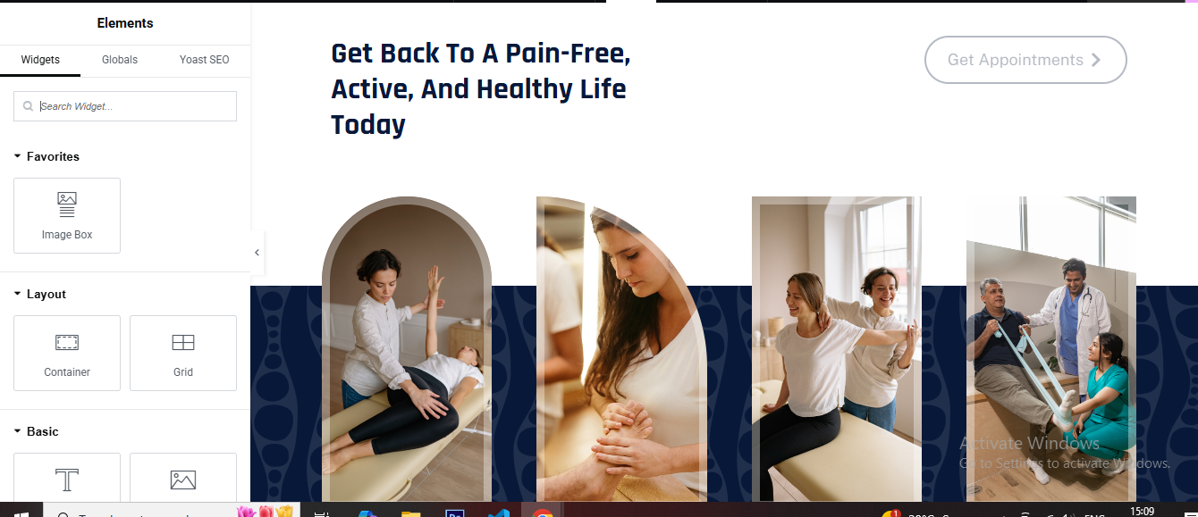
about section
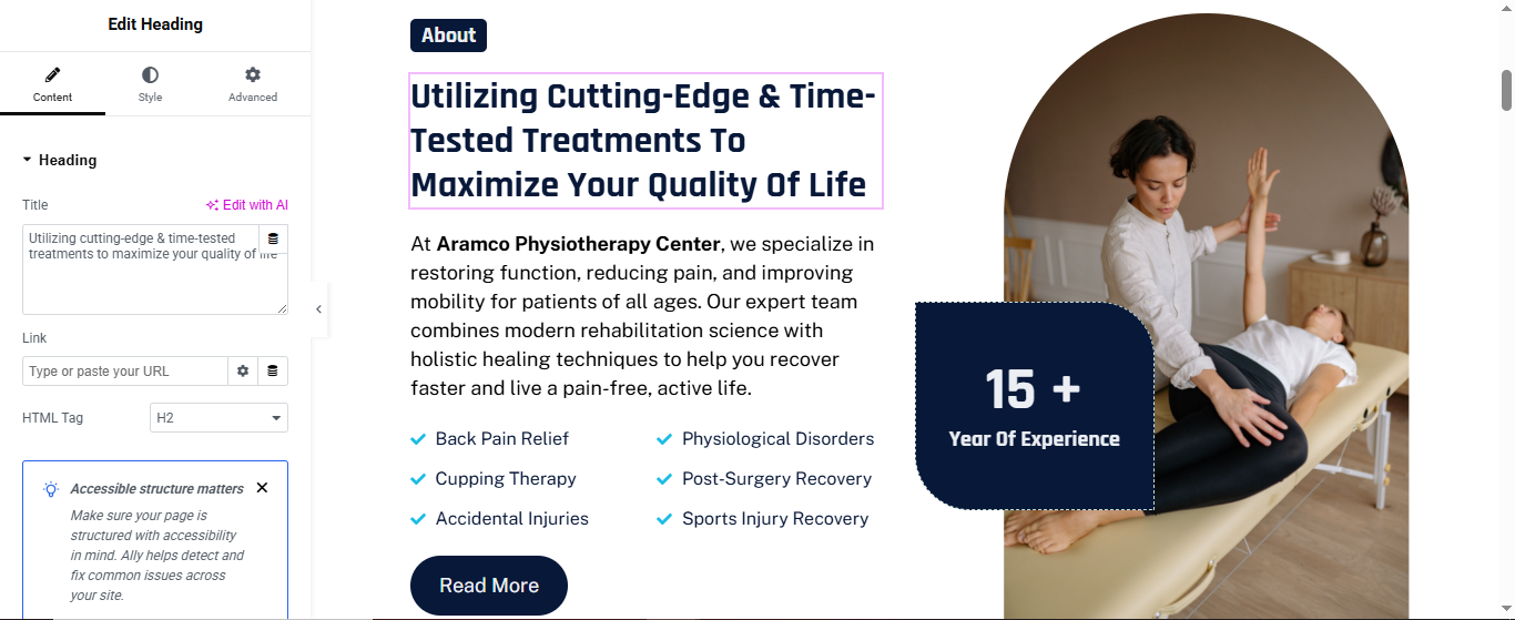
Click ➕ Add Section
- Choose 2 Columns
- Left Column: 55%
- Right Column: 45%
- Left Column – Content
- Drag Heading for small label
- Style:
- Background Color: Dark Blue
- Text Color: White
- Padding: 6px 14px
- Border Radius: 6px
- Font Size: 13px
same small label for all sectin title
Drag Heading for main heading
- Text:
- HTML Tag: H2
- Style:
- Size: 34–40px
- Weight: 700
- Line Height: 1.2
Drag Text Editor for description text
- Style:
- Font Size: 15–16px
- Line Height: 1.7
- Color: #555
Services List (Check Icons)
- Drag Icon List
- Add items:
- Style
- Icon: ✔
- Icon Color: Cyan Blue
- Text Color: Dark Blue
- Spacing: 12px
Drag Button for read more button
- Style:
- Background: Dark Blue
- Text Color: White
- Border Radius: 30px
- Padding: 14px 32px
right Column – Image & Experience Badge
- Drag Image for image
- Upload physiotherapy image
- Style:
- Border Radius: 50% or Top Right & Bottom Left: 120px
- Drag counter (or Inner Section) for experience badge
- Text:
- Style
- Background: Dark Blue
- Text Color: White
- Padding: 30px
- Border Radius: 20px
- Position: Absolute
- Bottom: 40px
- Left: -40px
- Box Shadow: 0 15px 35px rgba(0,0,0,0.25)
service section
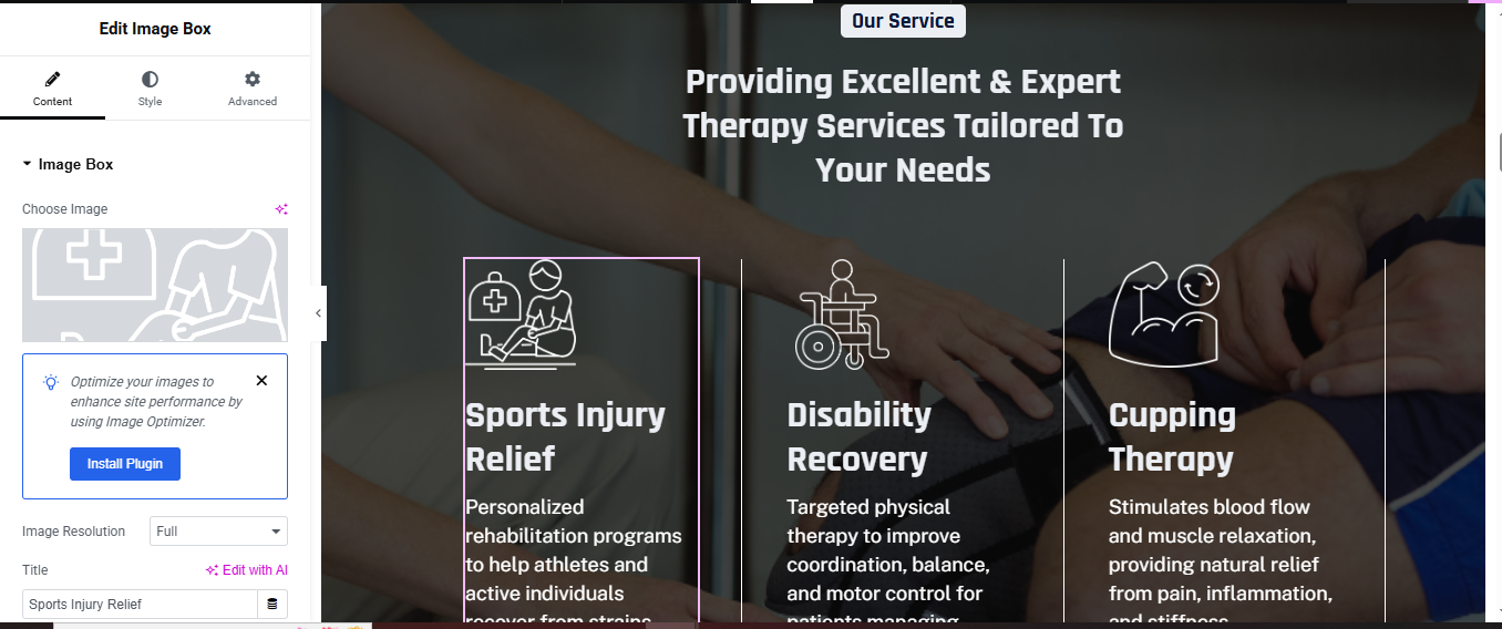
Click ➕ Add Section
- Section → Style
- Background Image: Physiotherapy treatment image
- Position: Center Center
- Size: Cover
- Overlay:
- Color: #000000
- Opacity: 0.65
Drag Heading for main heading
- HTML Tag: H2
- Style:
- Text Color: White
- Font Size: 36–42px
- Line Height: 1.2
- Align: Center
- Services Grid
- Drag Inner Section
Choose 3 Columns
- Service Card (Repeat for Each Service)
- Drag Image Box into each column.
- Image: Line icon (white SVG/PNG)
- Title:
- Description:
- Image Box Style
- Image: Width: 60px
- Title
- Color: #FFFFFF
- Size: 20px
- Weight: 600
- Description
- Color: #E0E0E0
- Size: 14px
- Line Height: 1.6
Card Styling
- Advanced → Background
- Background Color: rgba(255,255,255,0.1)
- Border Radius: 14px
- Padding: 30px
Hover Effect
- Background Color: rgba(255,255,255,0.18)
- Transition: 0.4s
achievement section
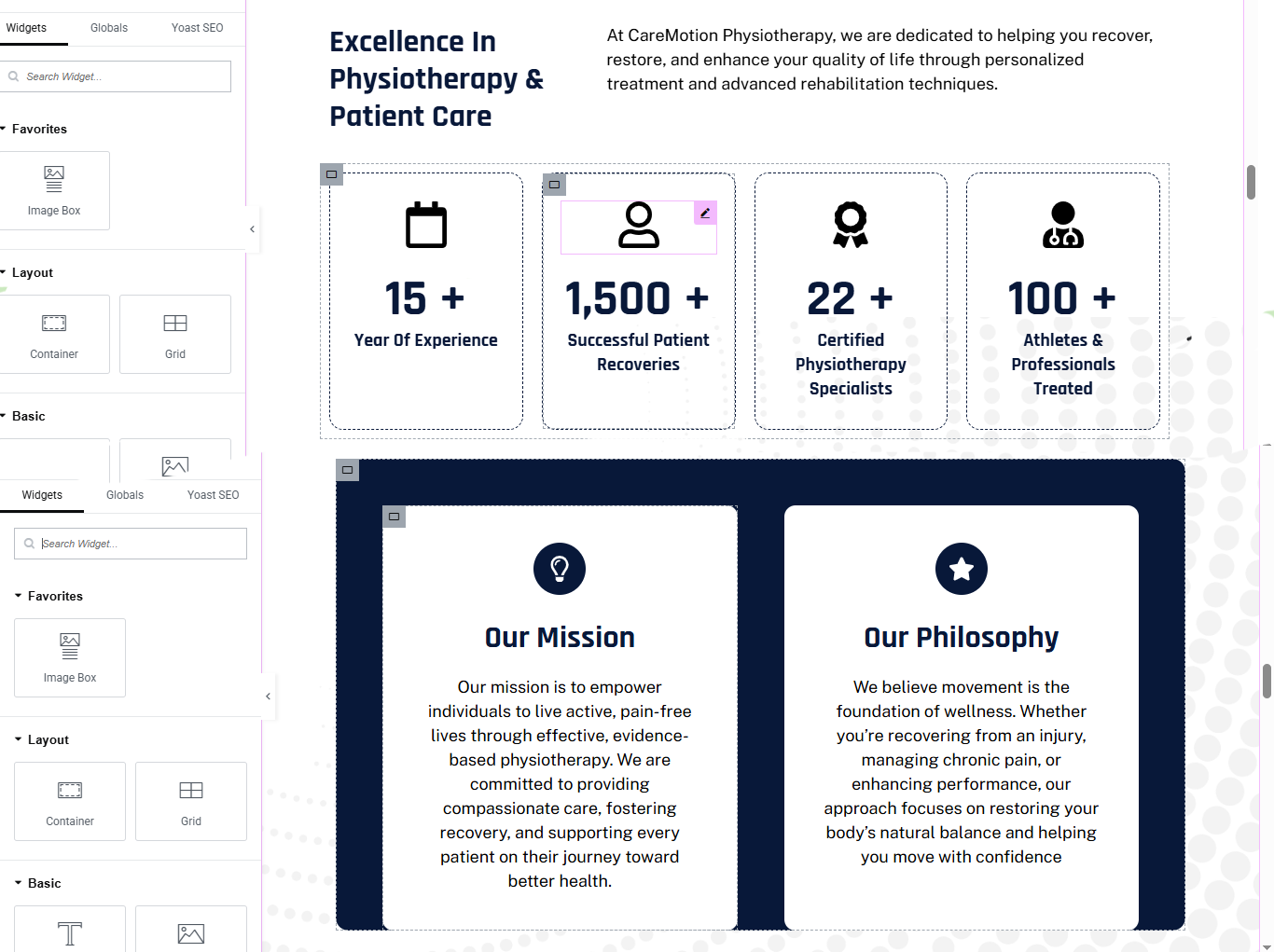
Click ➕ Add Section → 1 Column
- ADD SECTION HEADING (LEFT SIDE)
- Add Inner Section → 2 Columns (40% / 60%)
Left Column
- Drag Heading
- Style
- Color: #0A1F44
- Font Size: 36–40px
- Weight: 700
- Line Height: 1.2
ADD DESCRIPTION (RIGHT SIDE)
- Drag Text Editor
- Style
- Color: #555
- Font Size: 16px
- Line Height: 1.6
EACH ACHIEVEMENT CARD SETUP
- Widget: Image Box
- add a counter widget
- Title: 15+
- Description: Year Of Experience
- duplicate for all 4 box
CARD STYLE
- CARD BOX DESIGN
- Go to Advanced tab of Image Box:
- Background Color: #FFFFFF
- Border: 1px dashed #DDE3EA
- Border Radius: 16px
- Padding: 30px
Click ➕ Add Section → 1 Column
- Section → Advanced
- Background Color: #071C3A (dark blue)
- ADD INNER SECTION (2 CARDS)
- Add Inner Section → 2 Columns (50% / 50%)
Left Column
- Inner Section → Advanced
- Background Color: #FFFFFF
- Border Radius: 20px
- Padding: 50px
- Box Shadow: X: 0 Y: 10 Blur: 40 Color: rgba(0,0,0,0.08)
- Widget: Icon
- Icon: Lightbulb / Target
- Alignment: Center
- Color: #0A1F44
- Size: 36px
- Widget: Heading
- Style
- Color: #0A1F44
- Font Size: 26px
- Weight: 700
- Alignment: Center
Widget: Text Editor
- Style
- Color: #555
- Font Size: 15px
- Line Height: 1.7
- Alignment: Center
duplicate this column for vision card
change the icon, title, and description
why choose us section
Add Section → 1 Column
- Section → Style
- Background Color: #071C3A (Dark Navy)
- ADD TOP CONTENT (HEADING AREA)
Add Inner Section → 2 Columns (60% / 40%)
- LEFT COLUMN
- small label
- Heading (Main Title)
- Color: #FFFFFF
- Font Size: 44px
- Line Height: 1.3
- Font Weight: 700
RIGHT COLUMN – TEXT + BUTTON
- Text Editor
- Style:
- Color: #C9D6EA
- Font Size: 16px
- Line Height: 1.7
Button
- Style:
- Text Color: #FFFFFF
- Border: 1px solid #FFFFFF
- Border Radius: 30px
- Padding: 14px 26px
- Background: Transparent
- Hover Background: #FFFFFF
- Hover Text Color: #071C3A
ADD SERVICE CARDS (BOTTOM AREA)
- Inner Section → 4 Columns
- CARD DESIGN (FOR EACH COLUMN)
- Add Inner Section (inside each column)
- Inner Section → Style
- Background Color: #FFFFFF
- Border Radius: 22px
- Padding: 30px
- Widget: Icon
HEADING
- Color: #071C3A
- Font Size: 18px
- Weight: 700
TEXT
- Color: #555
- Font Size: 14px
- Line Height: 1.6
repear for all box and change icon, title and description
appointment section
Add Section → 1 Column
- Section → Layout
- ADD HEADING + BUTTON ROW
Add Inner Section → 2 Columns (70% / 30%)
- LEFT COLUMN – MAIN HEADING
- Heading
- Style:
- HTML Tag: H2
- Text Color: #071C3A
- Font Size: 40px
- Font Weight: 700
- Line Height: 1.3
RIGHT COLUMN – BUTTON
- Button
- Style:
- Text Color: #071C3A
- Background Color: Transparent
- Border: 1px solid #071C3A
- Border Radius: 30px
- Padding: 14px 28px
ADD IMAGE GALLERY AREA
- Add Inner Section → 4 Columns
IMAGE STYLE (CURVED SHAPE EFFECT)
- Go to Image → Style
- Border Radius: 120px 120px 0 0;
ADD BACKGROUND PATTERN (BOTTOM)
- Add Inner Section BELOW images
- Style → Background
- Background Color: #071C3A
- Margin Top: -180px
- Padding Top: 200px
- Padding Bottom: 60px
- Border Radius: 40px 40px 0 0
review section
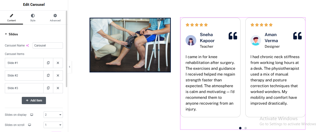
Add Section → 2 Columns (40% / 60%)
LEFT COLUMN – IMAGE
- Image Widget
RIGHT COLUMN – TESTIMONIAL SLIDER
- Carousel Widget
CAROUSEL SETTINGS (Content Tab)
- Slides on Display: 2
- Slides to Scroll: 1
- Navigation: Dots
CARD STRUCTURE (INSIDE EACH SLIDE)
- ⭐ Rating (Icons)
- ➕ Icon Widget
- Icon: Star
- Repeat: 5
- Color: #F9B233
- Size: 16px
Name & Role
- Heading
- HTML Tag: H4
- Font Size: 18px
- Font Weight: 600
Icon Widget for quote icon
- Icon: Quote Right
- Color: #071C3A
- Size: 28px
- Alignment: Right
Text Editor for review text
- Size: 15px
- Line Height: 1.7
CARD STYLE
- Inner Section → Style
- Background Color: #FFFFFF
- Border: 1px solid #E5E7EB
- Border Radius: 16px
- Padding: 30px
contact section
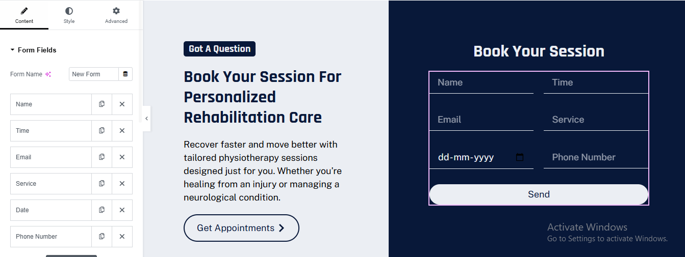
➕ Add Section → 2 Columns (50% / 50%)
LEFT COLUMN – CONTENT AREA
Small Label
- ➕ Heading Widget for main heading
- HTML Tag: H2
- Font Weight: 700
- Line Height: 1.3
➕ Text Editor for description
CTA Button
- ➕ Button Widget
RIGHT COLUMN – FORM CARD
- Column Background
- Background Color: #071C3A
- Border Radius: 20px
- Padding: 40px
ADD FORM WIDGET
- Name – Text
- Time – Time
- Email – Email
- Service – Select
- Date – Date
- Phone Number – Tel
FORM STYLE SETTINGS
- Text Color: #FFFFFF
- Placeholder Color: #AEB6C3
- Background Color: Transparent
- Border: Bottom Only
- Border Color: #FFFFFF
- Border Radius: 0
- Padding: 12px
logo slider section
Add 1-Column Section
ADD IMAGE CAROUSEL WIDGET
CONTENT SETTINGS
- Image Size: Medium
- Slides to Show: 5 (Desktop)
- Slides to Scroll: 1
- Autoplay: ON
- Navigation: OFF
- Dots: OFF
cardiologist pro theme documentation
introduction
customizing your website
global settings
To set global styles:
- Go to Elementor > Site Settings.
- Adjust typography, colors, and layout settings.
header & footer setup
- Use Elementor Theme Builder to edit the header and footer.
- Customize the navigation menu, logo, and contact details.
home page setup
Using Pre-Built Layouts
Navigate to Setting >> Reading
Choose the Static Page option.
Choose an existing homepage or create a new one.
Add The Section in home page using elementor
Add components such as these using the Drag & Drop Builder:
- Hero Section
- 3 box section
- why choose us section
- services section
- achievement Section
- Appointment Section
- Review Section
- Team Section
- logo slider section
hero section
Add 2-Column Section
LEFT COLUMN (CONTENT)
- ➕ Badge (Optional)
- Heading Widget
- Font Weight: 700
- Line Height: 1.2
- Text Color: #0A1F44
Text Editor
- Style:
- Text Color: #555
- Font Size: 16px
- Line Height: 1.7
Button Widget
- Style:
- Background: Dark Blue
- Text Color: White
- Padding: 14px 28px
- Border Radius: 50px
- Hover: Slightly lighter blue
RIGHT COLUMN (IMAGE)
- ➕ Image Widget
4 box section
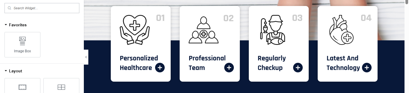
ADD INNER SECTION
- ➕ Inner Section → 4 Columns
- EACH BOX SETUP (REPEAT FOR ALL 4)
Image Box Widget
- Image: Line icon (Heart / Doctor / Checkup / Heart anatomy)
- Title:
- Box
- Background Color: White
- Border Radius: 20px
- Padding: 30px
- Box Shadow: Light
- Width: 60px
- Color: Dark Blue
Title
- Font Size: 18–20px
- Font Weight: 600
- Color: #0A1F44
NUMBER & PLUS ICON (OPTIONAL)
- To match 01 / + icon:
- ➕ Use Absolute Positioned Text
- 01, 02, 03, 04
- Opacity: 0.1
- Position: Top Right
- ➕ Add Icon Widget (+)
- Shape: Circle
- Background: Dark Blue
- Color: White
why choose us section
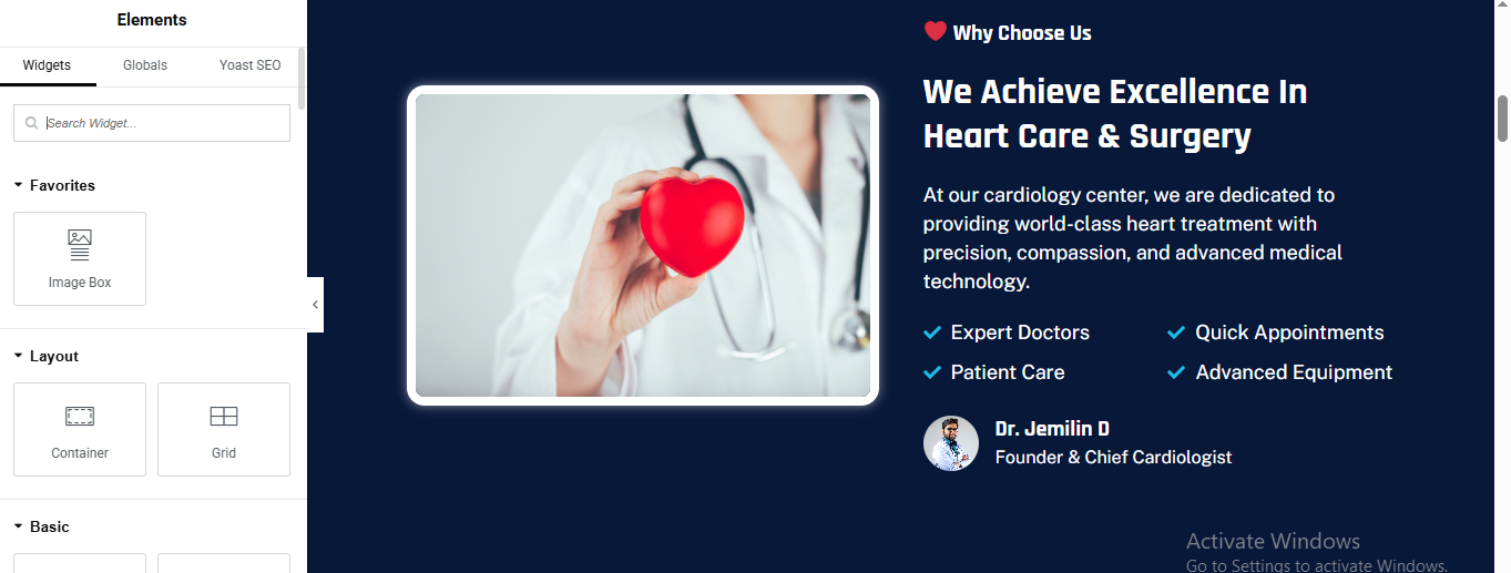
ADD MAIN SECTION
- ➕ Click + Add Section
ADD INNER SECTION (2 COLUMNS)
- ➕ Add Inner Section
LEFT COLUMN – IMAGE CARD
- Add Image Widget
- Style → Image
- Padding: 10px
- Background Color: #FFFFFF
- Border Radius: 18px
RIGHT COLUMN – CONTENT AREA
small label
- Add Heading Widget
- Text
- Style
- Text Color: #FFFFFF
- Font Size: 14px
➕ Add Text Editor for description text
- Text
- Style
- Text Color: #C9D6F2
- Font Size: 15–16px
- Line Height: 1.6
FEATURE LIST (CHECK ICONS)
- ➕ Add Inner Section (2 Columns)
EACH ITEM (REPEAT)
- ➕ Add Icon Box
- Style → Icon Box
- Title Color: #FFFFFF
- Icon Position: Left
- Spacing: 10px
DOCTOR PROFILE (BOTTOM)
- ➕ Add Inner Section (2 Columns)
Left Column – Image
- ➕ Image Widget
- Width: 50px
Right Column – Text
- ➕ Heading
- ➕ Text Editor
- Style
- Name Color: #FFFFFF
- Title Color: #AFC3F7
- Font Size: 14px
service section
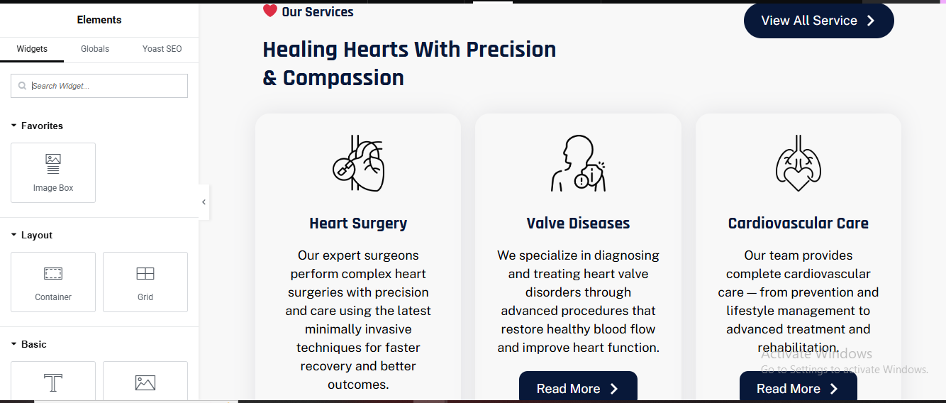
ADD MAIN SECTION
- ➕ Click + Add Section
TOP HEADER AREA (TITLE + BUTTON)
- ➕ Add Inner Section (2 Columns)
- Left: 70%
- Right: 30%
- Small Title
- Main Heading
➕ Add Heading
- style:
- Text Color: #0B1F3A
- Font Size: 36–40px
- Font Weight: 700
- Line Height: 1.3
RIGHT COLUMN – BUTTON
- add button widget
- style the hero button same
SERVICES BOXES (CARDS)
- ➕ Add Inner Section (6 Columns)
- add image box
- image width 60px
- title
- Title Color: #0B1F3A
- Title Size: 18–20px
- Text Color: #5F6C8F
- Text Size: 14–15px
card style
- Background Color: #F8F9FB
- Padding: 30px
- Border Radius: 20px
- Box Shadow: Soft
READ MORE BUTTON
- Text Color: #FFFFFF
- Background Color: #0B1F3A
- Border Radius: 30px
- Padding: 12px 24px
achievement section
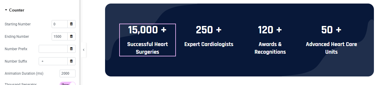
Click + Add Section
- Section Style
- Background Color: #071A3A (Dark Navy)
- Border Radius: 30px
- Padding:50px 40px;
ADD INNER SECTION (4 COLUMNS)
- Add Inner Section
ADD COUNTER WIDGET (EACH COLUMN)
- ➕ Drag Counter Widget into each column
- add counter number
- add title for counter
- Counter → Number
- Color: #FFFFFF
- Font Size: 36–40px
- Font Weight: 700
- Counter → Title
- Color: #E5ECFF
- Font Size: 14–16px
- Font Weight: 500
- Line Height: 1.4
REPEAT FOR ALL COUNTERS
appointment section
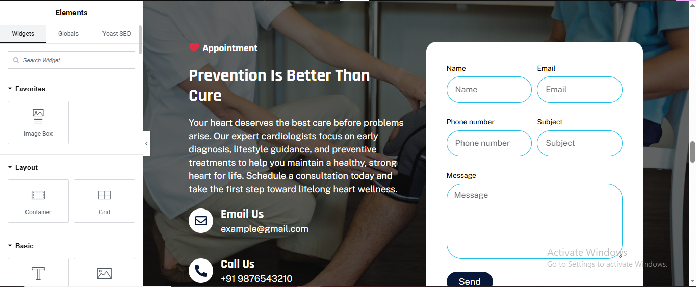
ADD MAIN SECTION
- ➕ Click Add Section → 2 Columns
SECTION BACKGROUND
- Style → Background
- Type: Image
- Image: Doctor / Patient consultation image
- Position: Center Center
- Size: Cover
LEFT COLUMN (TEXT CONTENT)
Small Label (Appointment)
- Heading
- Add Heading Widget
- Style:
- Color: #FFFFFF
- Font Size: 38–42px
- Font Weight: 700
- Description
- Add Text Editor
- Color: #E5ECFF
- Font Size: 15–16px
- Line Height: 1.6
CONTACT INFO (EMAIL & PHONE)
- Add Icon Box (Email)
- Add Icon Box (Phone)
- Icon: Phone
- Title: Call Us
- Description: +91 9876543210
- Icon Style
- Icon Color: #FFFFFF
- Background: #0A2A66
- Border Radius: 50%
RIGHT COLUMN (FORM CARD)
FORM CONTAINER (WHITE BOX)
- ➕ Add Inner Section → 1 Column
- Inner Section Style
- Background Color: #FFFFFF
- Border Radius: 20px
- Padding: 30px
- Box Shadow: 0px 15px 40px rgba(0,0,0,0.2)
ADD FORM WIDGET
- ➕ Drag Form Widget
- Form Fields (Same Order)
- Name – Text
- Email – Email
- Phone Number – Tel
- Subject – Text
- Message – Textarea
FORM STYLE SETTINGS
- Border Radius: 30px
- Border Color: #00AEEF
- Padding: 14px
- Text Color: #333
Button
- Text: Send
- Background: #071A3A
- Text Color: #FFFFFF
- Border Radius: 30px
- Padding: 14px 40px
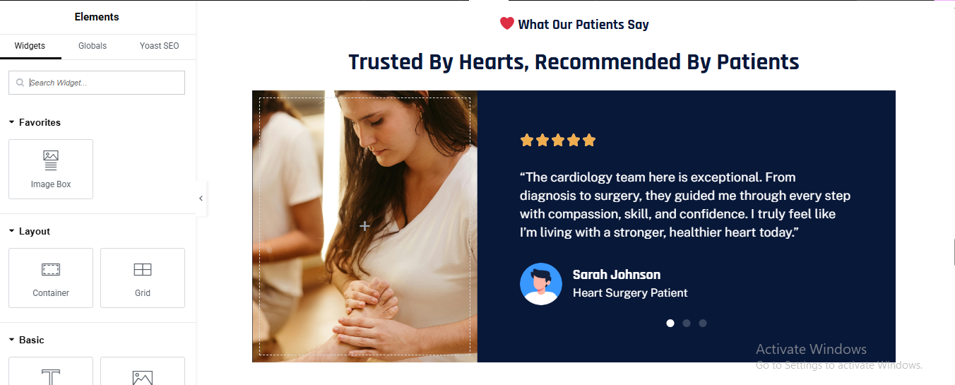
review section
Click Add Section → 2 Columns
SECTION BACKGROUND
- Style → Background
LEFT COLUMN (IMAGE)
- Width: 45%
- Add Image Widget
- Upload patient / healthcare image
RIGHT COLUMN (REVIEW CONTENT)
- Width: 55%
- Padding: 40px
- added testimonial review
STAR RATING
- Add Icon List
- Choose ⭐ Star icon
REVIEW TEXT
- Color: #E5ECFF
- Font Size: 16px
- Line Height: 1.7
PATIENT DETAILS
- add image box
- left image and right patient detail
- style the image box
team section
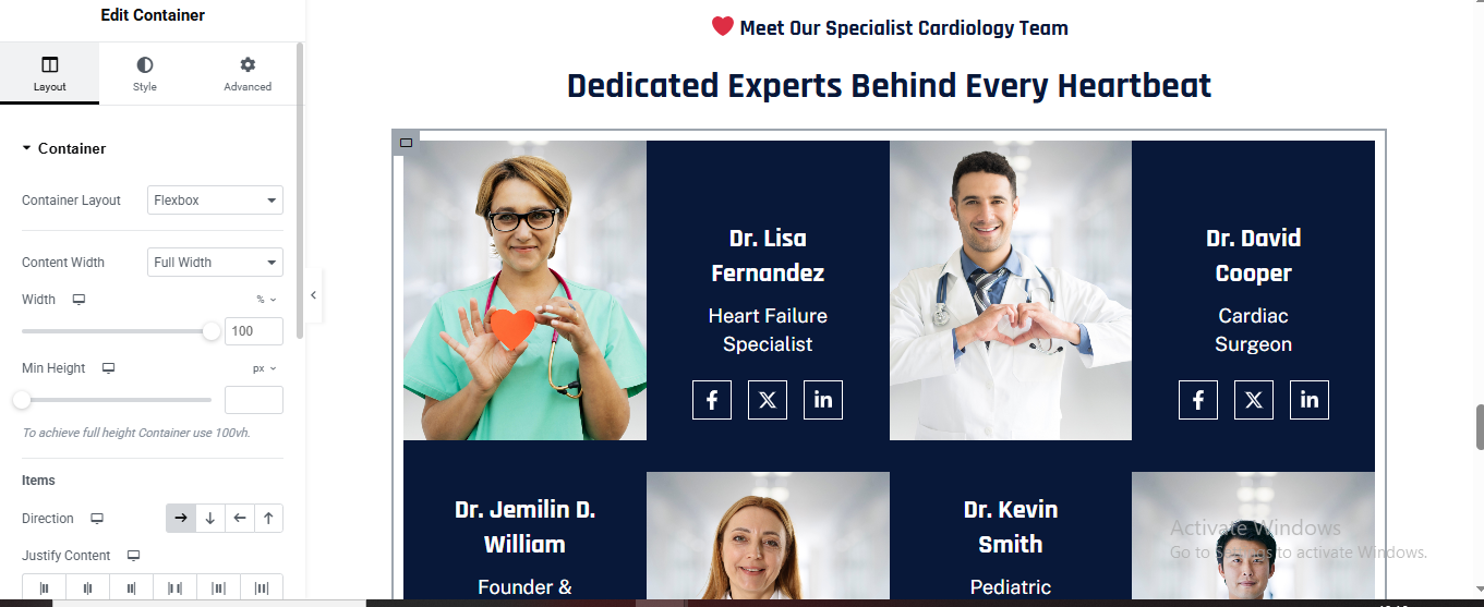
ADD MAIN CONTAINER
- ➕ Click Add Container
- Add Text Editor for section title
- Color: #FF4D4D
- Font Size: 14px
- Font Weight: 600
- Alignment: Center
Add Heading
- Color: #FFFFFF
- Font Size: 36–40px
- Font Weight: 700
- Alignment: Center
SINGLE TEAM CARD (REPEAT FOR EACH DOCTOR)
- ➕ Add Container (Team Card)
IMAGE CONTAINER (LEFT / TOP)
- ➕ Inside Team Card → Add Container
- add Image Widget
INFO CONTAINER (DARK BOX)
- ➕ Add Container under image (or right side if horizontal)
- Style
- Background Color: #081A33
- Padding: 30px
- Min Height: 100%
DOCTOR NAME
- ➕ Add Heading
- Style
- Color: #FFFFFF
- Font Size: 20px
- Font Weight: 700
DOCTOR DESIGNATION
- ➕ Add Text Editor
- Style
- Color: #C7D4FF
- Font Size: 14px
- Line Height: 1.6
SOCIAL ICONS
- ➕ Add Social Icons Widget
- X (Twitter)
- Style
- View: Framed
- Shape: Square
- Primary Color: Transparent
- Secondary Color: #FFFFFF
- Border Color: #FFFFFF
- Icon Size: 14px
- Spacing: 10px
DUPLICATE FOR ALL MEMBERS
- Right-click Team Card
- Click Duplicate
- Change:Image, Name, Role
logo slider section
Add 1-Column Section
ADD IMAGE CAROUSEL WIDGET
CONTENT SETTINGS
- Image Size: Medium
- Slides to Show: 5 (Desktop)
- Slides to Scroll: 1
- Autoplay: ON
- Navigation: OFF
- Dots: OFF
This cardiology clinic website serves as a comprehensive digital platform dedicated to delivering advanced heart care and cardiovascular wellness with compassion, precision, and trust. Designed with a patient-first approach and modern medical standards in mind, the website allows visitors to easily explore cardiac treatments, understand diagnostic and interventional procedures, schedule consultations, and connect with experienced cardiologists and heart specialists.
orthopedic pro theme documentation
introduction
customizing your website
global settings
To set global styles:
- Go to Elementor > Site Settings.
- Adjust typography, colors, and layout settings.
header & footer setup
- Use Elementor Theme Builder to edit the header and footer.
- Customize the navigation menu, logo, and contact details.
home page setup
Using Pre-Built Layouts
Navigate to Setting >> Reading
Choose the Static Page option.
Choose an existing homepage or create a new one.
Add The Section in home page using elementor
Add components such as these using the Drag & Drop Builder:
- Hero Section
- about section
- services section
- Achievement Section
- why choose us section
- Treatment Process
- Achievement Section
- Review Section
- Team Section
- Contact Section
hero section

Click ➕ Add Container
- Choose Two Columns (50% – 50%)
Left Column (Text Content)
- Drag Heading Widget for small heading
- Style → Typography
- Size: 14px
- Weight: 600
- Letter Spacing: 1px
- Color: Dark Blue / Primary Color
- Drag another Heading Widget for main hero heading
- Style → Typography
- Size: 54–64px
- Weight: 700–800
- Line Height: 1.2
- Color: Dark Navy / Black
- Text Editor Widget for description
- Style → Typography
- Size: 16–18px
- Line Height: 1.7
- Text Color: #555
Button 1 – Appointment
- Background: Primary Color
- Text Color: White
- Border Radius: 50px
- Padding: 16px 30px
- Font Weight: 600
- Drag Icon Widget
Choose Play Icon
- Shape: Circle
- Background Color: Dark Blue
- Icon Color: White
- Size: Medium
Right Column (Doctor Image)
- Drag Image Widget for image
- Upload Doctor Image
- Image Size: Full
- Alignment: Right
About section
Click ➕ Add Container
- Choose Two Columns (50% / 50%)
Left Column – Image Grid Layout
- Create Image Grid (2 × 2 Layout)
- Add Inner Container → Direction: Row
- Drag Image Widget for all 4 images
Right Column – Content Area
- Drag Heading Widget for small heading
- Drag another Heading Widget for main heading same style for banner main heading
- Drag text editor for description
- Feature List (Check Icons)
Add Icon List Widget
- Style
- Icon: Check
- Icon Color: Blue
- Text Size: 15–16px
- Review / Rating Box
- Add Inner Container → Direction: Column
- Star Rating
- Drag Star Rating Widget
- Rating: 5
- Color: Gold
Text Editor for review text
- Drag Button Widget for CTA button
- Style
- Background: Dark Blue
- Text Color: White
- Border Radius: 50px
- Padding: 16px 30px
service section
Click ➕ Add Container
- drag heading for small label
- drag another heading for main heading
- Size: 38–44px
- Weight: 700
- Line Height: 1.3
- Align: Center
Add Services Cards Container
- Add Inner Container
- Add Flip Box (Service Card)
⚠️ Flip Box widget is available in Elementor Pro
FLIP BOX SETTINGS (IMPORTANT)
Front Side (Image Side)
- Graphic Element: Image
- Upload Service Image
- Title:
- Style → Front
- Background: Image
- Overlay Color: Dark Blue (opacity 0.6)
- Border Radius: 20px
- Padding: 30px
- Typography
- Title Size: 20px
- Color: White
Back Side (Content Side)
- Content
- Button Text
- Back Style
- Background Color: White
- Text Color: Dark Gray
- Button Color: Primary Blue
- Border Radius: 20px
- Padding: 30px
Flip Settings
- Animation: Flip
- Direction: left
- Duration: 0.6s
- Duplicate for More Services
Right-click Flip Box → Duplicate
achievement section
Click + Add Section
- Section Style
- Background Color: #071A3A (Dark Navy)
- Border Radius: 30px
- Padding:50px 40px;
ADD INNER SECTION (4 COLUMNS)
- Add Inner Section
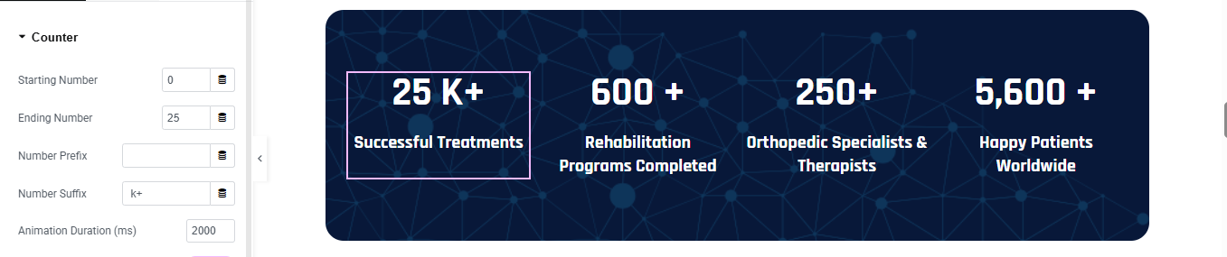
ADD COUNTER WIDGET (EACH COLUMN)
 Drag Counter Widget into each column
- add counter number
- add title for counter
- Counter → Number
- Color: #FFFFFF
- Font Size: 36–40px
- Font Weight: 700
- Counter → Title
- Color: #E5ECFF
- Font Size: 14–16px
- Font Weight: 500
- Line Height: 1.4
REPEAT FOR ALL COUNTERS
why choose us section
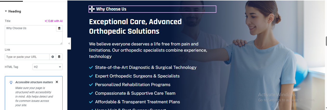
Click ➕ Add Container
- Background Image (Fixed Position)
- Parent Container → Style → Background
Background Type
- Type: Classic
- Image: Upload doctor–patient physiotherapy image
Background Settings
- Position: Center Right
- Attachment: Fixed ✅
- Repeat: No-repeat
- Size: Cover
Gradient Overlay (VERY IMPORTANT)
- Click Add Background
- Choose Gradient
- Color 1: #071b3a (Dark Navy)
- Color 2: #0c2d5c
- Location: 60% → 100%
- Angle: 90°
Add Inner Content Container
- Inside main container → Add Inner Container
- Set: Width: 55%
- Drag Heading Widget for small label
- Drag another Heading Widget fo mian heading
- add text editor for content
Feature Checklist (Check Icons)
- Drag Icon List Widget
- List Items
- Style
- Icon: Check
- Icon Color: Light Blue
- Text Color: White
- Size: 15–16px
- Spacing: 12px
Treatment Process section
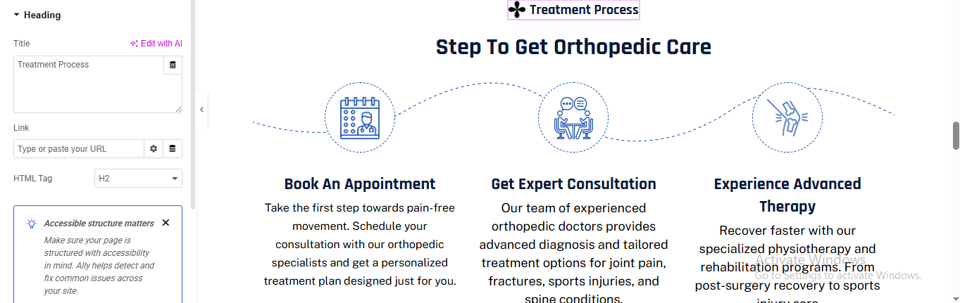
Click ➕ Add Container
- Drag Heading Widget for small label
- Drag another Heading Widget for main heading
Add Steps Container (3 Columns)
- Create One Step Box (Repeat 3 Times)
- Drag Icon Widget
- Choose appropriate icon:
- Style → Icon
- View: Stacked
- Shape: Circle
- Primary Color: White
- Secondary Color: Transparent
- Border Type: Dashed
- Border Width: 2px
- Border Color: Primary Blue
- Icon Color: Primary Blue
- Size: 40–45px
Step Title
- Drag Heading Widget
- Style
- Size: 18–20px
- Weight: 600
- Align: Center
Step Description
- Drag Text Editor Widget
- Style
- Font Size: 15–16px
- Line Height: 1.6
- Text Color: #555
- Align: Center
Add Curved Dotted Line (Connector)
- Option A – Using Image (Recommended)
- Drag Image Widget
- Upload a dotted curved line PNG/SVG
- Advanced → Position: Absolute
- Top: 120px
- Left: 0
- Width: 100%
- Opacity: 0.6
review section
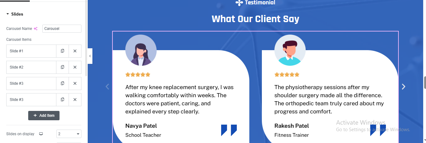
Click ➕ Add Container
- Click Parent Container → Style → Background
- Color: Primary Blue (medical theme)
- Drag Heading Widget for small heading
- Drag another Heading Widget for main heading
Add Testimonial Slider
- Elementor Carousel
- Slider Settings (Important)
- Add multiple slides (Slide #1, #2, #3)
- Slides to Show: 2
- Slides to Scroll: 1
- Infinite Loop: Yes
- Autoplay: Yes (optional)
- Speed: 500–700
Testimonial Card Container
- Style
- Background Color: White
- Border Radius: 40px
- Padding: 40px
- Box Shadow: Light
- Drag Image Widget for client avatar
- Upload avatar image (or illustration)
- Size: 70px
- Border Radius: 50%
Star Rating
- Drag Star Rating Widget
- Drag Text Editor Widget for review text
- Drag image box widget for client name and Client Role
- Drag Icon Widget for quote icon (Bottom Right)
Choose quote icon
- Position: Absolute
- Bottom: 30px
- Right: 30px
- Color: Primary Blue
- Size: Large
team section
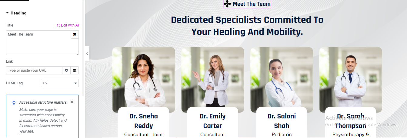
Click ➕ Add Container
- Background Styling (Wave Effect)
- Click Parent Container → Style → Background
- Type: Classic
- Color: Light Gray / Off White (#f7f7f7)
- Optional Pattern
- Upload subtle wave / line pattern
- Opacity: 0.15
- Position: Center
- Repeat: No-repeat
- Size: Cover
Drag Heading Widget for small label
Drag another Heading Widget for main title
Add Team Cards Container
- Create One Team Card (Repeat for Each Doctor)
- Team Card Container
- Style
- Background: White
- Border Radius: 20px
- Box Shadow: Light
- Padding: 20px
Doctor Image
- Drag Image Widget
- Upload doctor photo
- Doctor Info Box
- Style
- Background: White
- Border Radius: 15px
- Margin Top: -40px
- Padding: 15px
- Box Shadow: Soft
Drag Heading Widget for doctor name
- Style:
- Size: 18–20px
- Weight: 600
- Align: Center
Drag Text Editor for doctor designation
Duplicate for Other Team Members
contact section
Click ➕ Add Container
- Choose Two Columns (50% / 50%)
Left Column – Google Map
- Width: 50%
- Min Height: 450px
- Add Google Map Widget
- Drag Google Maps Widget
- Enter your clinic location
Right Column – Contact Form Box
- Drag Heading Widget for contact section heading
- Style
- Font Size: 30–34px
- Font Weight: 700
- Text Color: Dark Blue
Add Contact Form
⚠️ IMPORTANT: The Form widget requires Elementor Pro
- Style the Form (Rounded Look)
- Form → Style → Fields
- Border Radius: 50px
- Border Width: 1px
- Border Color: Light Blue
- Padding: 14px
- Background: White
- Style Submit Button
- Button Style
- Background Color: Dark Blue
- Text Color: White
- Border Radius: 50px
- Padding: 14px 40px
- Font Weight: 600
- Align: Left
Child Specialist pro theme documentation
introduction
customizing your website
global settings
To set global styles:
- Go to Elementor > Site Settings.
- Adjust typography, colors, and layout settings.
header & footer setup
- Use Elementor Theme Builder to edit the header and footer.
- Customize the navigation menu, logo, and contact details.
home page setup
Using Pre-Built Layouts
Navigate to Setting >> Reading
Choose the Static Page option.
Choose an existing homepage or create a new one.
Add The Section in home page using elementor
Add components such as these using the Drag & Drop Builder:
- Hero Section
- about section
- services section
- CTA Section
- why choose us section
- Review Section
- Team Section
- Contact Section
hero section
Click ➕ Add Container
- Select Main Container
- Go to Style → Background
- Background Type: Slideshow
Add Main Heading
- HTML Tag: H1
- Color: #FFFFFF
- Line Height: 1.2
- Font Weight: 700–800
Add Button widget
- Background: #FFFFFF
- Text Color: #061A3A
- Border Radius: 6px
- Padding: 16px 28px
Add Text Editor widget
- Color: #FFFFFF
- Font Size: 14px
- Margin Top: 15px
About section
Click ➕ Add Section
- Select 2 Columns
Left Column – Image Grid Setup
- drag image widget for image
Right Column – Content Setup
- Icon List (ABOUT US Label)
- Drag Icon List Widget
- Item Text → ABOUT US
- Icon → Simple medical/heart icon
- Layout → Inline
- Text Color → Blue
- Font Weight → 600
- Icon Size → 14px
Same style for all section small label
Drag Heading Widget for main heading
- Style
- Font Size → 36–40px
- Font Weight → 700
- Line Height → 1.3
Drag Text Editor Widget for description
- Icon List (Services Highlights)
- Drag Icon List Widget
- Style
- Icon → Heart / Check / Medical icon
- Icon Color → Blue
- Text Color → Dark
- Columns → 2 (Responsive)
Button (Read More)
- Drag Button Widget
- Style
- Background → Dark Blue
- Text Color → White
- Border Radius → 30px
- Padding → 14px 28px
Service section
Click ➕ Add Container
- Background: Light pattern or #f7f9fc
Drag Heading for small label
Drag another Heading for main heading
Add Services Grid
- Add Inner Container
- Direction: Row
- Gap: 24px
Create Service Box (Card)
- Layout
- Direction: Column
- Align: Center
- Padding: 30px
- Border Radius: 20px
- Background: #ffffff
Add Icon/Image
- Drag Image
- Upload SVG or PNG
- Width: 70px
- Margin Bottom: 20px
Add Service Title
- Tag: H3
- Font Size: 20px
- Weight: 600
- Align: Center
Drag Text Editor
- Align: Center
- Color: Gray
- Margin Bottom: 20px
Drag Button for button
- Text: Read More
- Border Radius: 50px
- Padding: 14px 30px
Duplicate Service Cards
✔ Right-click service box → Duplicate
CTA section
Click ➕ Add Container
- Select Flexbox → Direction: Row
Add Left Content Column
- Drag Heading for small label
- Drag another Heading for main heading or tagline
- CTA Button
- Drag Button
- Text: Book an Appointment
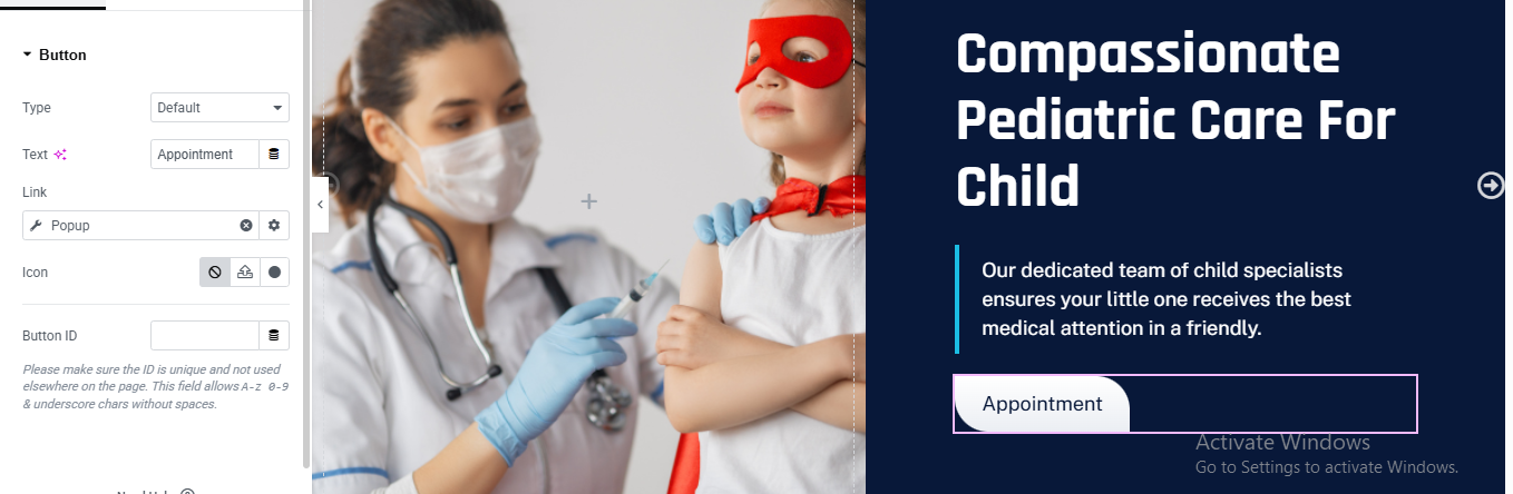
- Link: Popup / Appointment page
- Padding: 16px 36px
- Border Radius: 50px
- Button Styling
- Style → Button
- Background: #ffffff
- Text Color: #061c3f
- Hover Background: #0ea5e9
- Hover Text Color: #ffffff
- Transition Duration: 0.4s
Add Right Image Column
- Drag Image
- Upload doctors team image
why choose us section
Click ➕ Add Section
- Choose 2 Columns (40% | 60%)
LEFT COLUMN – IMAGE
- Drag Image widget
- Upload your image (doctor + child)
- Image Style
- Border Radius: 20px
- Box Shadow: light shadow (optional)
RIGHT COLUMN CONTENT
- drag heading for top small label
- Drag Heading widget for main heading
- Drag Text Editor for description text
FEATURE BOXES (DOTTED BORDER)
- Drag Inner Section
- Choose 2 columns
FEATURE BOX 1
- Drag Icon Box
- Content:
- Title:
- Description: Your text
- Icon: child / doctor
- Style
- Background: #ffffff
- Padding: 30px
- Border Radius: 16px
- Border Style: Dashed
- Border Width: 2px
- Border Color: #2bbcff
duplicate for feature box and change image, title, and description
Review section
Click ➕ Add Section
- Section → Style
- Background Color: #071B3A (dark navy)
- Style
- Color: #FFFFFF
- Typography:
- Size: 36–40px
- Weight: 700
- Alignment: Center
- Margin Bottom: 40px
Add Heading Widget for small label
Add another Heading Widget for main title
ADD CAROUSEL WIDGET FOR REVIE SLIDERE
- Carousel → Layout
- Slides to Show: 2
- Slides to Scroll: 1
- Infinite Loop: ✅ ON
- Autoplay: ✅ ON (optional)
- Add Item (Add 3–4 items)
- Each slide will contain:
Avatar, Stars, Name, Role, Review text
🧑 Avatar Image
- Image Size: 80×80
- Border Radius: 50%
- Align: Center
⭐ Star Rating
- Widget: Star Rating
- Rating Scale: 5
- Rating: 5
- Color: Gold #FFC107
- Align: Center
👤 Name
- Widget: Heading
- Text: Priya Mehta
- Color: White
- Size: 18px
- Align: Center
👶 Role
- Widget: Text Editor
- Text: Mother of 3-Year-Old
- Color: #B5C7E3
- Align: Center
💬 Review Text
- Widget: Text Editor
STYLE SLIDE CARD (IMPORTANT)
- Select Inner Section
- Style → Background
- Color: #0B254F
- Border Radius: 16px
- Padding: 40px 30px
- Border
- Border: 1px solid rgba(255,255,255,0.1)
Team section
Click ➕ Add Section
- Drag Heading Widget for small label
- Drag Another Heading Widget for main Heading
- Size: 36px
- Weight: 700
- Drag Text Editor for description Text
CREATE TEAM MEMBER CARD (REPEAT FOR ALL)
FOR EACH COLUMN (TEAM MEMBER)
- Drag Image box Widget for team member detail
- Upload doctor image
added doctor name
- Alignment → Center
- Typography → Bold
added text for doctor Designation
Drag Social Icons Widget for doctor Social Icons
CARD BACKGROUND & SHADOW
- Style Tab
- Background → White
- Border Radius → 16px
- Box Shadow → Light
DUPLICATE TEAM MEMBERS
- Right-click the column
- Click Duplicate
Contact section
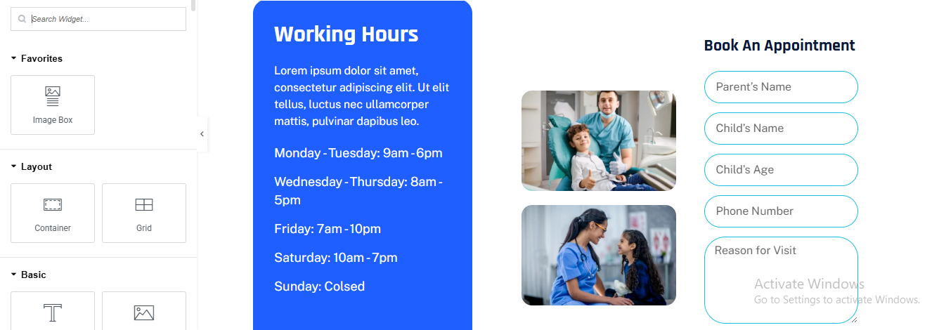
Click ➕ Add Section
- Choose 3 Columns
Left Column – Working Hours Box (Blue Card)
- Background Color: #2563EB (blue)
- Padding: 40px
- Border Radius: 16px
Drag Heading
- Color: #ffffff
- Typography:
- Size: 28px
- Weight: 700
Drag Text Editor for description
- Color: #E5E7EB
- Line Height: 1.6
Middle Column – Image Stack
- Drag Image for 2 images
- Upload first image and than upload second image
Right Column – Appointment Form
- Drag Heading for heading
- Drag Form widget (Elementor PRO)
Form Widget → Content → Form Fields
- Parent’s Name, Child’s Name, Child’s Age, Phone Number, Reason for Visit
- go to style tab add style for form field
- border 1px solid blue
- border radius 30px
- background white
- for row gap 15px
- submit button style
- background dark blue
- text color white
neurologist pro theme documentation
introduction
customizing your website
global settings
To set global styles:
- Go to Elementor > Site Settings.
- Adjust typography, colors, and layout settings.
header & footer setup
- Use Elementor Theme Builder to edit the header and footer.
- Customize the navigation menu, logo, and contact details.
home page setup
Using Pre-Built Layouts
Navigate to Setting >> Reading
Choose the Static Page option.
Choose an existing homepage or create a new one.
Add The Section in home page using elementor
Add components such as these using the Drag & Drop Builder:
- Hero Section
- about section
- services section
- CTA Section
- why choose us section
- Achievement Section
- Team Section
- Review Section
- Blog Section
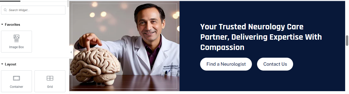
hero section
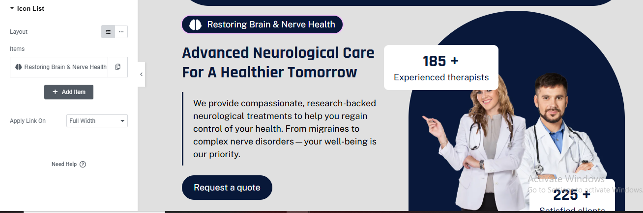
Click ➕ Add Section
- Choose 2 Columns (60% Left / 40% Right)
- Section → Style
- Background Color: #EDEDED
LEFT COLUMN – CONTENT
- Drag Icon List for main small label
- Style
- Background: dark blue
- Border Radius: 50px
- Padding: 6px 16px
- Text Color: White
- Icon: Brain icon
- Alignment: Left
same styling for all section small label
Add Heading Widget for heading
- Style
- Color: #0B1E3A
- Size: 44–48px
- Weight: 700
- Line Height: 1.2
Add Text Editor for description text
- Color: #444
- Size: 16px
- Max Width: 90%
CTA Button
- Add Button Widget
- Style
- Background: #0B1E3A
- Text Color: White
- Border Radius: 30px
- Padding: 14px 30px
RIGHT COLUMN – IMAGE
- Add Image Widget
- Upload doctor image (PNG preferred)
- Image Size: Full
ADD BACKGROUND SHAPE (DARK CURVE)
- Select Right Column
- Style → Background
- Add Background Color: #0B1E3A
- Border Radius:
- Top Left: 200px
- Bottom Left: 200px
FLOATING STATS BOX (185+)
- Position: Absolute
- Top: 80px
- Left: -40px
- Inner Section → Style
- Background: White
- Border Radius: 16px
- Padding: 20px 24px
- Box Shadow: Light
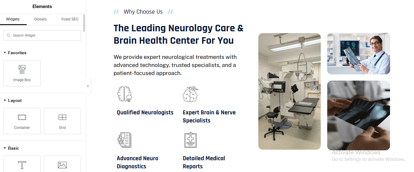
About section
Click ➕ Add Section
LEFT COLUMN – IMAGE COLLAGE
- add image widget for about image create in photoshop or any other
RIGHT COLUMN – CONTENT
- Add Heading Widget for top small label
- Add another Heading Widget for main heading
- Services (Two Columns)
- Add Inner Section
- Choose 2 Columns
added service name and small description for service
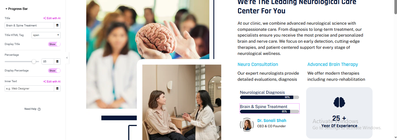
Drag Progress Bar Widget for progress bar
- Percentage: added if you wish
- Display Percentage: ON
- Duplicate Progress Bar
Progress Bar → Style
- Track Color: #E5E7EB
- Fill Color: #0B1E3A
- Height: 6px
- Border Radius: 10px
- Title Color: #111
- Percentage Color: White
DOCTOR INFO BLOCK
- Add Image (Doctor Avatar)
- Image Size: 60px
- Border Radius: 50%
- Add Heading
- Add Text
Service section
Click ➕ Add Section
- Background Color: #F5F7FA
- Drag Heading Widget for small label
- Typography:
- Size: 14px
- Weight: 600
Add another Heading for main heading
- Typography:
- Size: 40px (desktop)
- Weight: 700
- Color: #0A1D3A
Drag Text Editor for description text
CREATE SERVICES GRID
- Card Container Settings
- Width: 33%
- Background: #FFFFFF
- Border Radius: 20px
- Overflow: Hidden
Drag Image Widget
- Bottom Title Bar (Important Part)
- Drag Inner Container below image
- Background Color:
Card 1: #19C2EA
Card 2 & 3: #081C3A
- Padding: 20px
- Border Radius:
- Bottom Left: 20px
- Bottom Right: 20px
Service Title Text
- Add Heading Widget
- Tag: H4
- Color: #FFFFFF
- Typography:
- Size: 18px
- Weight: 600
HOVER EFFECT (OPTIONAL BUT RECOMMENDED)
- Select Service Card Container
- Go to Advanced → Motion Effects
- Hover Animation: Move Up
- Transition Duration: 0.4s
CTA section
Click ➕ Add Section
LEFT SIDE – IMAGE CONTAINER
- Drag Image Widget
- Upload doctor / neurologist image
RIGHT SIDE – CTA CONTENT CONTAINER
- Drag Heading Widget for main heading
- Color: #FFFFFF
- Typography:
- Size: 36px
- Weight: 700
- Line Height: 1.3
ADD BUTTONS CONTAINER
BUTTON 1 – FIND A NEUROLOGIST
- Style
- Text Color: #081C3A
- Background: #FFFFFF
- Border Radius: 50px
- Padding: 18px 30px
- Font Weight: 600
same styling for button 2
why choose us section
Click ➕ Add Section
LEFT CONTAINER (TEXT CONTENT)
- Drag Heading for small label
- Drag Heading for main heading
- Drag Text Editor for description text
FEATURES (ICON + TEXT)
- Feature Item (Repeat 4 Times)
- Icon
- Drag Image Widget
- Upload line-style icon (brain, report, doctor)
- Width: 40px
Drag Heading for title
- Tag: H5
- Color: #0A1D3A
- Font Weight: 600
- Tag: H5
- Color: #0A1D3A
- Font Weight: 600
RIGHT CONTAINER (IMAGE GRID)
- Top Large Image
- Drag Image Widget
- Upload hospital / equipment image
- Settings:
- Border Radius: 20px
- Width: 100%
Bottom Images (2-Column)
- Add Inner Container
- Direction: Row
- Gap: 20px
- Add Two Image Widgets
- Border Radius: 20px
achievements section
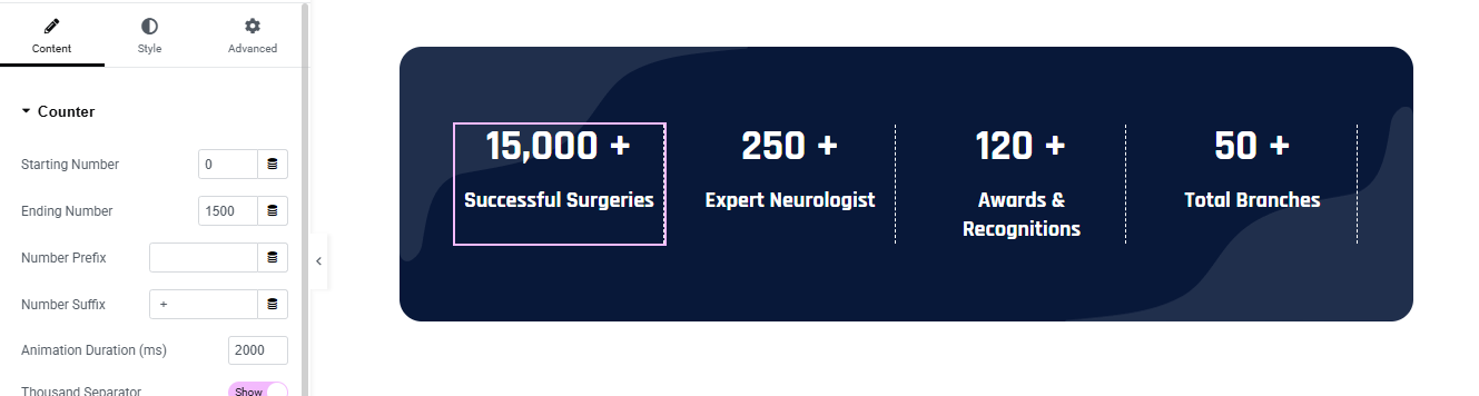
Click + Add Section
- Section Style
- Background Color: #071A3A (Dark Navy)
- Border Radius: 30px
- Padding:50px 40px;
ADD INNER SECTION (4 COLUMNS)
- Add Inner Section
ADD COUNTER WIDGET (EACH COLUMN)
- Drag Counter Widget into each column
- add counter number
- add title for counter
- Counter → Number
- Color: #FFFFFF
- Font Size: 36–40px
- Font Weight: 700
- Counter → Title
- Color: #E5ECFF
- Font Size: 14–16px
- Font Weight: 500
- Line Height: 1.4
REPEAT FOR ALL COUNTERS
team section
Click ➕ Add Section
SECTION HEADING (TOP AREA)
- Add Inner Container
LEFT SIDE – TITLES
- Add Container
- Width: 60%
- Direction: Column
Drag Heading for small heading
Add Heading for main heading
- Tag: H2
- Color: #0A1D3A
- Typography:
- Size: 38px
- Weight: 700
RIGHT SIDE – DESCRIPTION
- Width: 40%
- Direction: Column
- Justify Content: Center
TEAM CARDS CONTAINER
CREATE TEAM CARD (Repeat 3 Times)
- Set:
- Width: 33%
- Border Radius: 25px
- Overflow: Hidden
- Background: Linear Gradient
- Left: #DDE7DB (light green) – 50%
- Right: #081C3A (dark blue) – 50%
Drag Image for doctor image
- Upload doctor PNG (transparent preferred)
- Width: 140px
- Align: Left
- Margin Bottom: 20px
Doctor Name
- Tag: H4
- Color: #FFFFFF
- Font Weight: 600
- Drag Text Editor
- Drag Social Icons Widget for social icons
- Style
- Icon Color: #081C3A
- Background Color: #FFFFFF
- Size: 16px
- Border Radius: 6px
- Spacing: 10px
Review section
Click ➕ Add Section
- Drag Heading for small label
- Drag another Heading for main title
ADD CAROUSEL SLIDES
DESIGN TESTIMONIAL CARD (SLIDE CONTENT)
- Slide Layout (Inside Each Slide)
- Background Color: #F6F1E7
- Border Radius: 25px
- Padding: 30px
added image box widget for patient image and its details
- Drag Image Widget for avatar
- Upload avatar icon
- Width: 50px
- Border Radius: 50%
- Name & Treatment
- Tag: H5
- Color: #0A1D3A
- Weight: 600
Add Text Editor
- Drag Text Editor for review text
- Drag Star Rating Widget for star rating
- Rating: ⭐⭐⭐⭐⭐
- Color: #F5A623
- Size: 18px
QUOTE ICON (BOTTOM RIGHT)
- Drag Icon Widget
- Choose Quote Right
- Color: #0A1D3A
- Size: 24px
- Align: Right
CAROUSEL SETTINGS
- Slides to Show: 3
- Slides to Scroll: 1
- Autoplay: Yes
- Pause on Hover: Yes
- Infinite Loop: Yes
Blog section
Add Main Section
- Click Add Container
- Background Design
- Style → Background
- Type:light color
Add Posts Widget
- Content → Layout
- Skin: Cards
- Columns: 3
- Posts Per Page: 3
- Show Image: Yes
- Image Resolution: Medium (300×300)
- Image Ratio: 0.66
- Masonry: Off
Query Settings
- Content → Query
- Source: Posts
- Order By: Date
- Order: DESC
Card Style
- Style → Card
- Background Color: #ffffff
- Border Radius: 14px
- Box Shadow:X: 0, Y: 20, Blur: 40
- Color: rgba(15, 23, 42, 0.12)
- Padding: 25px
gynecologist pro theme documentation
introduction
customizing your website
global settings
To set global styles:
- Go to Elementor > Site Settings.
- Adjust typography, colors, and layout settings.
header & footer setup
- Use Elementor Theme Builder to edit the header and footer.
- Customize the navigation menu, logo, and contact details.
home page setup
Using Pre-Built Layouts
Navigate to Setting >> Reading
Choose the Static Page option.
Choose an existing homepage or create a new one.
Add The Section in home page using elementor
Add components such as these using the Drag & Drop Builder:
- Hero Section
- 3 box section
- about section
- services section
- Achievement Section
- Appointment Section
- How to care
- who we are section
- FAQ’s Section
- Team Section
- Review Section
- Contact Section
hero section
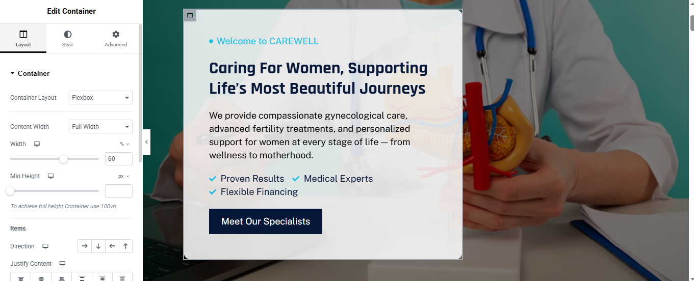
Click ➕ Add Section
ADD BACKGROUND IMAGE
- Select Main Section
- Go to Style → Background
- Choose Background Type: Classic
ADD CONTENT BOX (WHITE OVERLAY)
- Background Color: rgba(255,255,255,0.95)
- Border Radius: 20px
- Padding: 50px
Drag Heading for top small label
- Tag: H6
- Color: #00B4E5
- Typography:
- Size: 14px
- Weight: 600
Drag another Heading for mian title
- Tag: H1
- Color: #0A1D3A
- Typography:
- Size: 44px
- Weight: 700
- Line Height: 1.2
Drag Text Editor for description text
CHECKLIST ITEMS
- Drag Icon List Widget
- Add items:
- Icon: ✔
- Icon Color: #00B4E5
- Text Color: #0A1D3A
CTA BUTTON
- Drag Button Widget
- Style
- Background: #081C3A
- Text Color: #FFFFFF
- Padding: 16px 30px
- Border Radius: 6px
- Font Weight: 600
3 box section
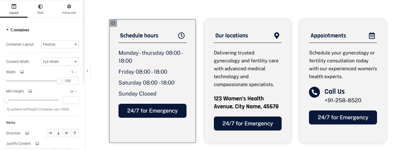
Click ➕ Add Section
- CREATE INFO BOX (REPEAT 3 TIMES)
- BOX CONTAINER SETTINGS
- Set:
- Width: 33.33%
- Direction: Column
- Justify Content: Space Between
- Padding: 30px
- Background Color: #FFFFFF
- Border Radius: 16px
BOX HEADER (TITLE + ICON)
- Drag Heading for title
- Tag: H4
- Color: #0A1D3A
- Font Weight: 600
- Drag Icon Widget for icon
- Choose icon:
- Color: #0A1D3A
- Size: 22px
- Divider Line
- Style:
- Color: #E5E5E5
- Weight: 1px
- Margin: 15px top & bottom
BOX CONTENT
- 🔹 Box 1 – Schedule Hours
- 🔹 Box 2 – Our Locations
- 🔹 Box 3 – Appointments
CTA BUTTON
- Drag Button Widget
- Style:
- Background: #081C3A
- Text Color: #FFFFFF
- Padding: 14px 24px
- Border Radius: 6px
- Font Weight: 600
- Margin Top: 20px
about section
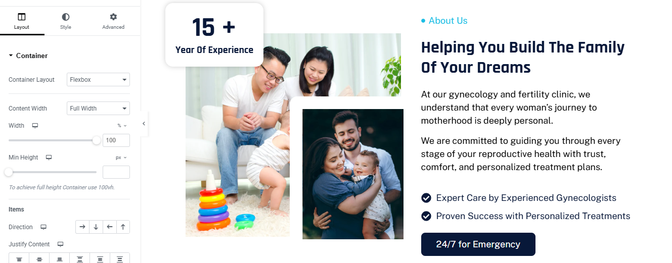
Click ➕ Add Container
ADD TWO INNER CONTAINERS
LEFT SIDE – IMAGE SETUP
➤ Image 1 (Main Image)
- Drag Image Widget
- Upload family image
- Style:
- Border Radius → 20px
- Width → 100%
➤ Image 2 (Overlay Image)
- Drag another Image Widget
- Upload second family image
- Advanced → Positioning:
- Position → Absolute
- Bottom → -40px
- Right → -40px
- Width → 260px
- Z-Index → 5
- Style:
- Border Radius → 20px
- Box Shadow → Enabled
RIGHT SIDE – CONTENT SETUP
- Add Heading Widget for small label
- Text → • About Us
- HTML Tag → Span
- Color → Blue
- Typography → Small / Medium weight
- Add Heading Widget for main heading
- HTML Tag → H2
- Line Height → 1.2
- Add Text Editor for description text
Feature List (Icons)
- Add Icon List Widget
- Icon Color → Dark Blue
- Spacing → 12px
CTA Button
- Add Button Widget
- Background → Dark Blue
- Text Color → White
- Border Radius → 8px
- Padding → 16px 28px
service section
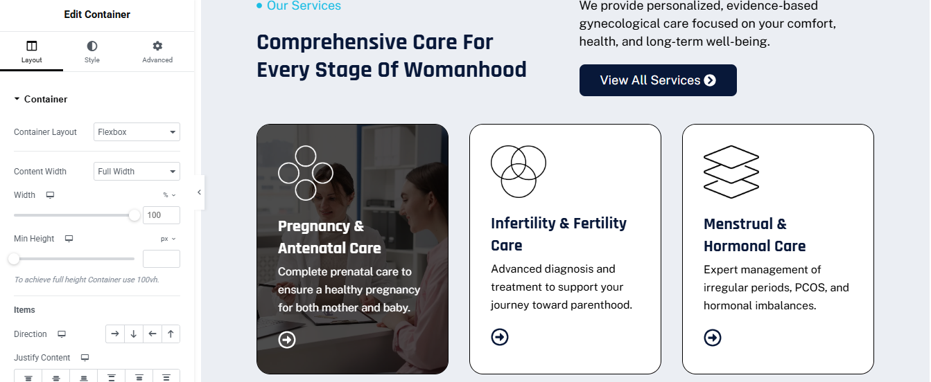
Click ➕ Add Container
- TOP CONTENT AREA
- Left Side – Text
- Add Inner Container (Left)
- Widget → Heading for small heading
- Text → • Our Services
- HTML Tag → span
- Color → Blue
- Widget → Heading for main heading
- HTML Tag → H2
➤ Right Side – Description + Button
- Add Inner Container (Right)
- Button
- Text → View All Services
- Icon → Arrow Right
- Background → Dark Blue
- Border Radius → 8px
- Padding → 14px 26px
SERVICES CARDS CONTAINER
- Add Inner Container
- Direction → Row
- Gap → 30px
SERVICE CARD 1 – IMAGE CARD (LEFT)
- Width → 33%
- Background → color
- Border Radius → 20px
- Overflow → Hidden
- Position → Relative
- Content Inside Card
- Add Inner Container (Inside Image Card)
- Vertical Align → Bottom
- Padding → 30px
- Gap → 12px
- Icon
- Widget → Icon
- Color → White
- Text
- Color → Light Gray
- Arrow Icon
- Icon → Arrow Circle
- Color → White
SERVICE CARD 2 & 3 – OUTLINED CARDS
- Width → 33%
- Background → White
- Border → 1px solid #000
- Border Radius → 20px
- Padding → 30px
- Min Height → 420px
- Justify Content → Space Between
HOVER EFFECT (OPTIONAL – NO CODE)
- added background image on hover
- hover the box need icon, text, description color chnage black to white
achievement section
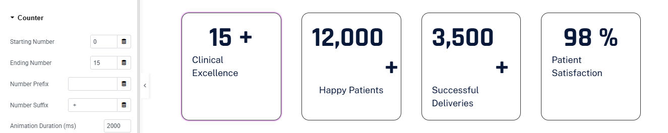
Click ➕ Add Container
ADD INNER CONTAINER (4 COLUMNS)
COUNTER CARD DESIGN (REPEAT FOR ALL 4)
- ➤ Add Inner Container (Card)
- Layout:
- Width → 25%
- Min Height → 220px
- Padding → 30px
- Justify Content → Center
- Align Items → Center
- Gap → 10px
- Style:
- Background → White
- Border → 1px solid #0B1D3A
- Border Radius → 16px
- Box Shadow → Optional light shadow
ADD COUNTER WIDGET
- Drag Counter Widget inside card.
- Counter Settings (Example: Card 1)
- Starting Number → 0
- Ending Number → 15
- Number Suffix → +
- Animation Duration → 2000
- added title
Appointment section
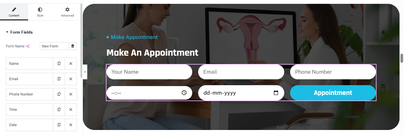
Click ➕ Add Container
- Style → Background:
- Type → Image
- Select gynecology image
- Position → Center Center
- Size → Cover
ADD DARK OVERLAY
- Style → Background Overlay:
- Color → #0B1D3A
- Opacity → 0.75
- Blend Mode → Normal
- Widget → Heading for small label
- Widget → Heading for mail heading
FORM WIDGET (IMPORTANT)
- Drag Form Widget below headings.
ADD FORM FIELDS
- ➤ Field 1 – Name
- Type → Text
- Placeholder → Your Name
- Column Width → 33%
- ➤ Field 2 – Email
- Type → Email
- Placeholder → Email
- Column Width → 33%
- ➤ Field 3 – Phone
- Type → Tel
- Placeholder → Phone Number
- Column Width → 33%
- ➤ Field 4 – Time
- Type → Time
- Column Width → 33%
- ➤ Field 5 – Date
- Type → Date
- Placeholder → dd-mm-yyyy
- Column Width → 33%
- ➤ Submit Button
- Text → Appointment
- Column Width → 33%
7️⃣ FORM STYLE SETTINGS (CRITICAL)
- ➤ Fields
- Background → White
- Border Radius → 30px
- Padding → 16px 20px
- Border → None
- Text Color → Dark Blue
- ➤ Button
- Background → Cyan / Blue
- Border Radius → 30px
- Font Weight → 600
- Padding → 16px 30px
- Hover → Darker shade
how to care section
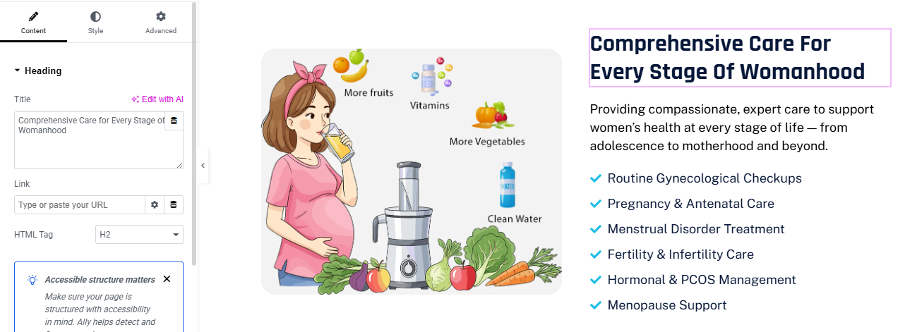
Click ➕ Add Container
ADD INNER CONTAINER
LEFT COLUMN – IMAGE CARD
- Add Image Widget
- Upload illustration image
- Image Size → Full
- Border Radius → 20px
RIGHT COLUMN – CONTENT
- Widget → Heading for main heading
ADD DESCRIPTION
- Widget → Text Editor
- Text Color → Gray
- Line Height → 1.6
ADD CHECKLIST (IMPORTANT)
- Widget → Icon List
- Icon List Style
- Icon → Check Circle
- Icon Color → Blue
- Text Color → Dark Blue
- Spacing → 12px
- Icon Position → Left
who we are section
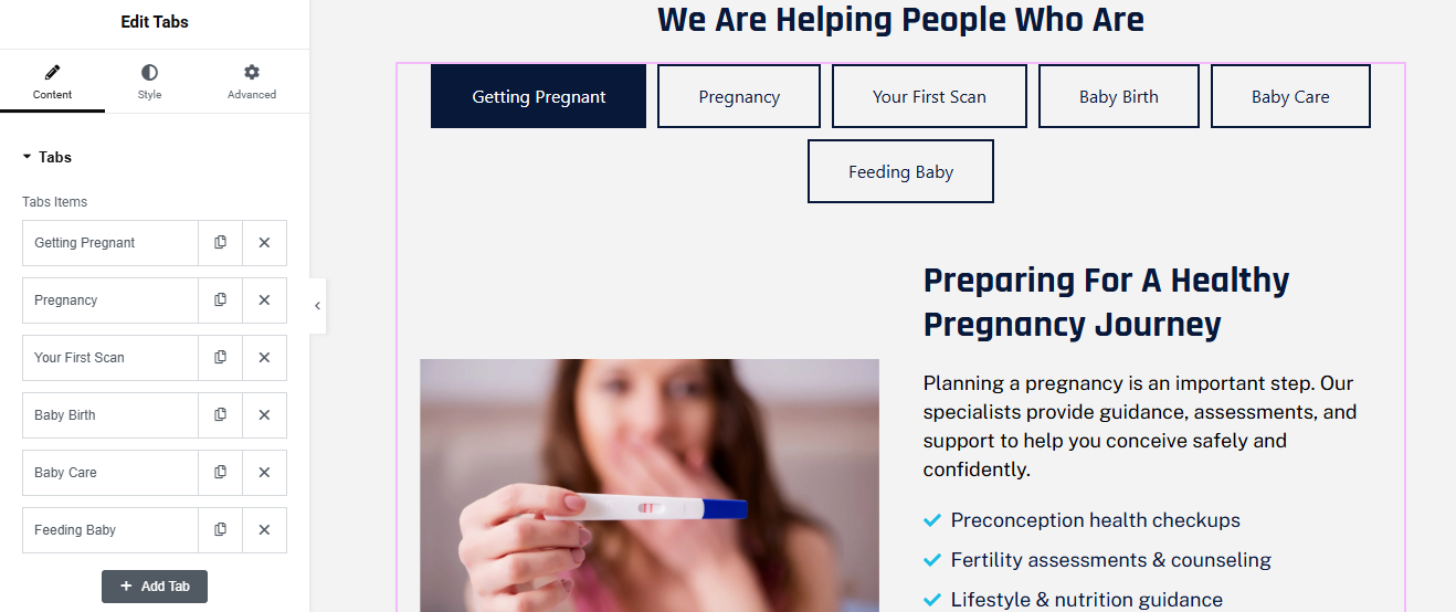
Click ➕ Add Container
- Add Heading Widget
- HTML Tag → H2
- Alignment → Center
- Text Color → Dark Blue
- Margin Bottom → 30px
ADD TABS WIDGET
- Drag Tabs Widget
- Tabs Position → Top
- Alignment → Center
ADD TAB ITEMS
TAB CONTENT – LEFT IMAGE
- Add Image Widget
- Upload related image
- Border Radius → 15px
TAB CONTENT – RIGHT CONTENT
- Widget → Heading for heading
- Widget → Text Editor for description
Add Icon List
- Use Icon List Widget
- Type → Check
- Color → Blue
STYLE TAB BUTTONS (MATCH DESIGN)
- Tabs → Style → Tabs
Normal
- Background → White
- Border → 1px Solid Dark Blue
- Text Color → Dark Blue
- Padding → 15px 25px
Active
- Background → Dark Blue
- Text Color → White
- Border Radius → 6px
FAQ's section
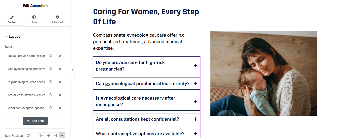
Click ➕ Add Container
- CREATE TWO COLUMNS
- ADD HEADING (LEFT)
- Add Heading Widget
- ADD DESCRIPTION TEXT
- Add Text Editor Widget
ADD ACCORDION WIDGET (FAQ)
- Drag Accordion Widget
ACCORDION STYLE SETTINGS (IMPORTANT)
- ➤ Accordion → Style → Item
- Background Color → #FFFFFF
- Border → 1px solid #0A1D3B
- Border Radius → 6px
- Padding → 18px
- Title Style
- Text Color → Dark Blue
- Typography → Medium / Semi-Bold
- Icon Position → Right
- Icon → Plus
➤ Active Item
- Title Color → Dark Blue
- Background → Light Gray (#F8F9FB)
➤ Content Style
- Text Color → Dark Gray
- Padding → 15px 0
ADD RIGHT SIDE IMAGE
- Drag Image Widget
- Upload Image
- Image Size → Full
- Border Radius → 20px
Team section
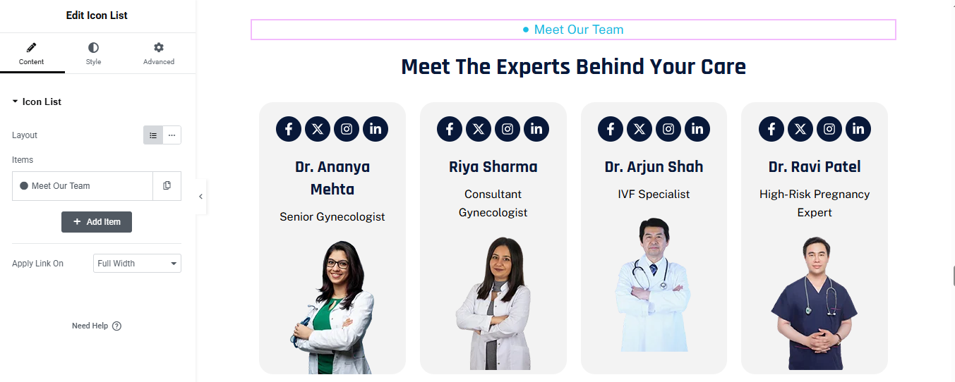
Click ➕ Add Container
- Add Heading Widget for small label
- Add another Heading Widget for main heading
ADD TEAM CARDS CONTAINER
- Add Inner Container
- Direction → Row
- Gap → 30px
- Justify Content → Center
ADD SOCIAL ICONS (TOP)
- Add Social Icons Widget
- Icons:
- View → Stacked
- Shape → Circle
- Alignment → Center
- Style
- Icon Color → White
- Background → Dark Blue
- Size → Small
- Spacing → 8px
Add Heading Widget for doctor name
- HTML Tag → H4
- Alignment → Center
- Color → Dark Blue
Add Text Editor Widget for description
- Add Image Widget for doctor image
- Upload Doctor Image
- Size → Medium / Large
- Alignment → Center
DUPLICATE TEAM CARD
- Right-click Team Card Container
review section
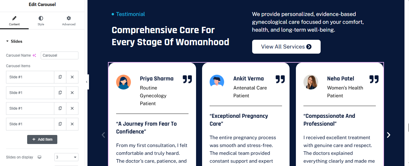
Click ➕ Add Container
- Background:
- Type → color → dark blue
ADD LEFT CONTENT CONTAINER
- Width → 40%
- Direction → Column
- Gap → 20px
- Testimonial Label
- Add Icon List
Add Heading for main heading
- HTML Tag → H2
- Color → White
- Line Height → 1.2
Add Text Editor for description
- Add Button for button
- Text → View All Services
- Icon → Arrow Right
- Background → White
- Text Color → Dark Blue
- Border Radius → 30px
- Padding → 14px 30px
ADD CAROUSEL WIDGET
- Use Elementor Pro → Carousel
- Card Container
- Background → White
- Border Radius → 24px
- Padding → 30px
- Min Height → 420px
- Direction → Column
- Justify Content → Space Between
Top Row (Avatar + Name)
- added image and heading
- and added icon widget for quote icon
- added in top right
Add Divider
- Color → Light Gray
- Review Title
- Add Heading (H4)
- Review Text
- Add Text Editor
STYLE SETTINGS
- Card Style
- Box Shadow → Soft
- Border → None
- Arrow Style
- Color → White
- Size → Medium
- Position → Inside
contact section
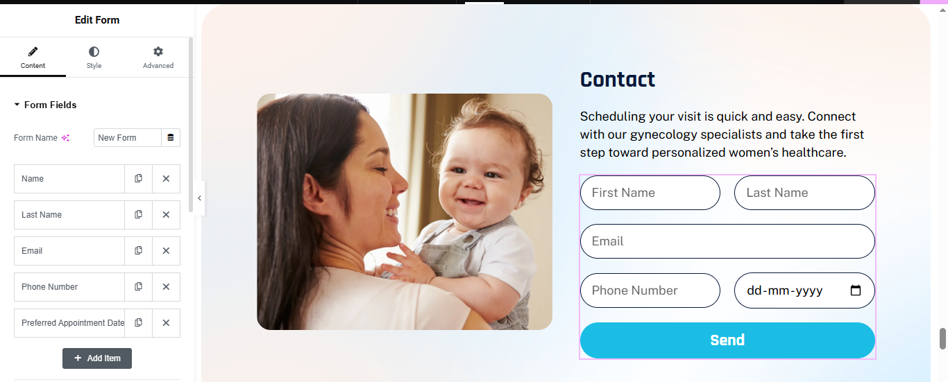
Click ➕ Add Container
- Background
- Type → Gradient
- Left Color → Soft Peach #FFF4EE
- Right Color → Light Blue #E9F7FF
- Border Radius → 40px
ADD LEFT IMAGE CONTAINER
- Width → 45%
- Add Image Widget
- Upload your image
- Image Size → full
ADD RIGHT FORM CONTAINER
- Width → 55%
- Heading Widget for heading
- Text Editor Widget for description
ADD ELEMENTOR FORM
- Add Form Widget (Elementor Pro)
- Add fields in this order:
First Name
- Type → Text
- Column Width → 50%
Last Name
- Type → Text
- Column Width → 50%
- Type → Email
- Column Width → 100%
Phone Number
- Type → Tel
- Column Width → 50%
Preferred Appointment Date
- Type → Date
- Column Width → 50%
🔹 Submit Button
- Text → Send
- Alignment → Full Width
STYLE THE FORM (IMPORTANT)
- Style → Form Fields
- Height → 56px
- Background → White
- Border Color → Dark Blue
- Border Width → 1px
- Border Radius → 30px
- Padding → 16px
Submit Button
- Style → Button
- Background → Cyan / Teal #1EC6E6
- Text Color → White
- Border Radius → 35px
- Height → 60px
- Font Weight → 600